LeafLife
An informative website to introduce the LeafLife application
Click to visit the LeafLife app case study
At a Glance
LeafLife is a community-centric website and mobile application dedicated to promoting environmental sustainability.
Our platform is committed to preserving the environment through the implementation of eco-friendly practices.
Project Overview
As a student at UXland, After delivering the LeafLife app, we were assigned to design an informative website to familiarize users with this platform with these details:
Goal
Develop a hub where concerned users can familiarize themselves with an app that can unite with eco-enthusiasts to incorporate green practices into daily cultural habits.
Boosting user engagement by raising environmental understanding.
Stakeholder Needs
We started by defining a hypothetical stakeholder and determined its requirements and limitations in the first stage.
As "LeafLife" is still beginning its journey, it needed a website that could introduce its application features to green living individuals.
Because this is the first website created for "LeafLife", developing a motivational user-friendly website will allow it to grow over time.
1 Month - Part time
Click to visit the LeafLife app case study

Duration
Team
Role
Tools

Group of Four
UX/UI Designer
Figma, Miro, Photoshop, AI, Maze, Zoom
Task
Design an informative website to motivate users to download the LeafLife eco-friendly application.
Design Strategy
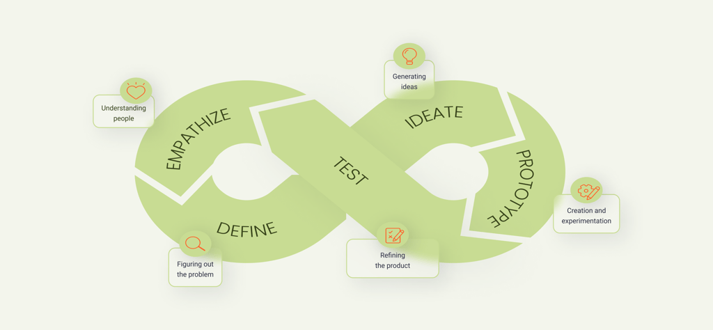
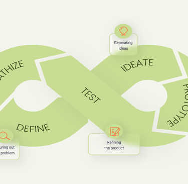
We took help from the design thinking method. It wasn't a linear path, we went back and forth between stages as the project progressed.
_________
Emphasize
1
2
3
4
5
_________
_________
_________
Define
Ideate
Prototype
Test
Competitive Analyses
Interview
Survey
Persona
Sitemap
Task Flow
Challenge & Solution
Sketching
Wireframing
Mood Board
UI Kit
High fidelity Prototype
Usability Testing
A-B Testing
Clickable Prototype
Emphasize
Top Takeaways:
How to present business values and their sustainable impact.
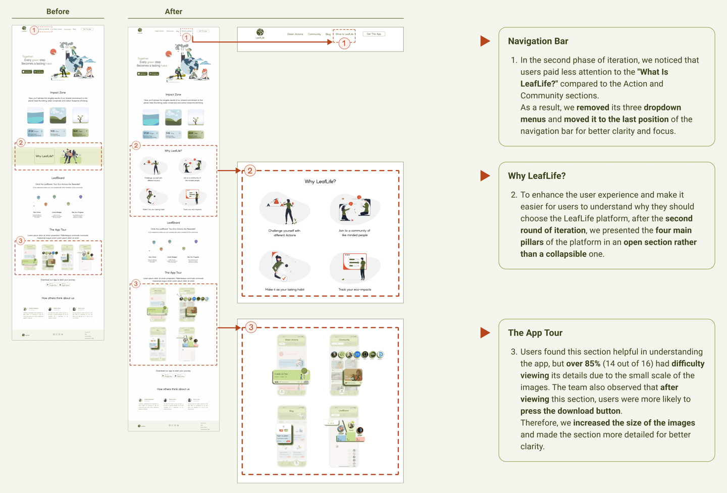
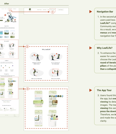
Identified categories of the navigation bar.
Easy access to download the application at first glance.
Introduce the application's key features visually and explain how to use it easily.
The importance of users' awareness of sustainable living.
Competitive Analysis
What capabilities do our competitors have?
During our analysis, we noticed features and workflows that fit the needs of our stakeholders. By doing this, we could design a more effective information architecture and discover what questions we needed to ask in the survey to more accurately capture our user needs.
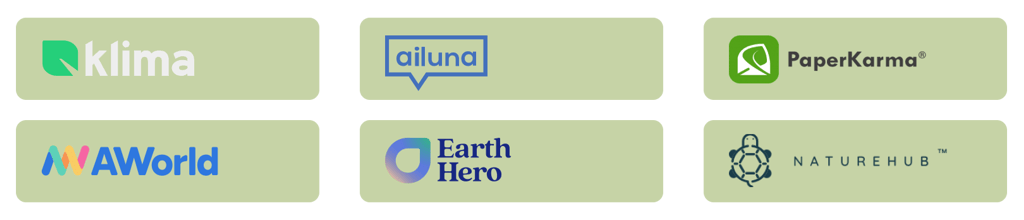
Logos of some competitors
To understand the users' pain points and develop effective solutions, we employed a comprehensive research approach that consisted of the following methods:
Competitive Analysis
Re-analysis of App interviews
Online Survey

Click to visit the LeafLife app case study
Lack of awareness about environmental activities and their impact.
Feeling a sense of futility and discontinuity in past experiences.
Unfamiliarity with the structure of platforms designed to support sustainable living.
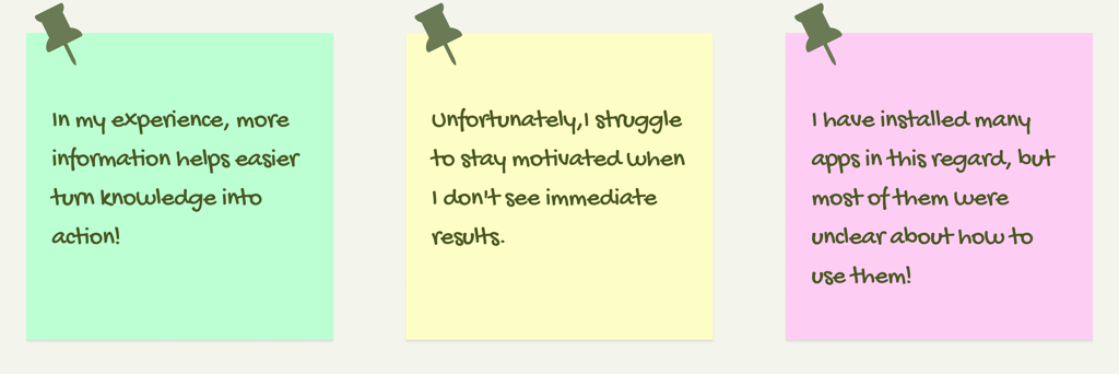
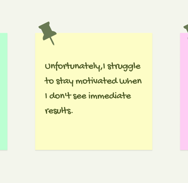
User quotes in 3 relevant categories
Interview
Learning about users' perspective
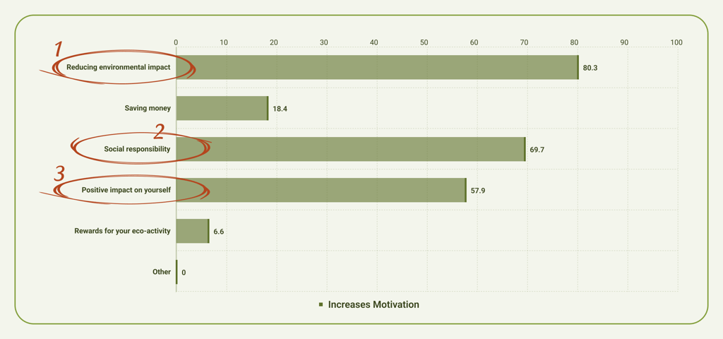
Since we designed our interview questions based on user interaction with a sustainable platform, after re-analyzing the collected data, we reached; the following remarkable three takeaways,
Top Takeaways:
Using these three takeaways helped us better identify users' pain points and focus on resolving them through the website to improve their next step experience within the application.
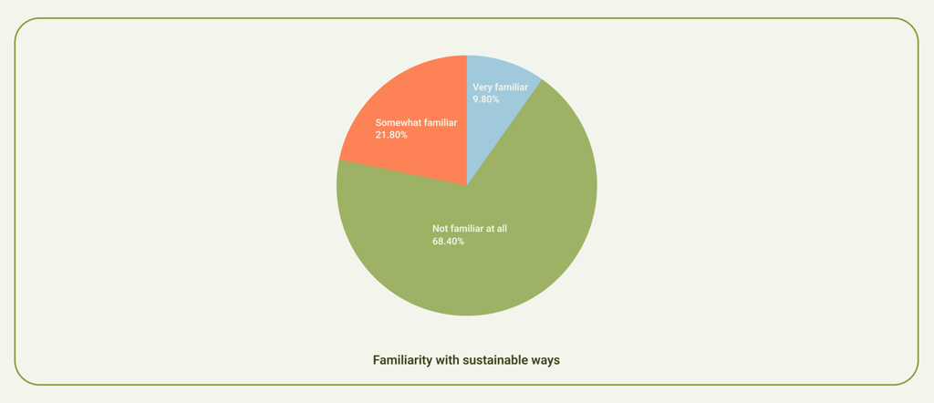
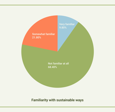
Surprisingly, more than 80% of the participants were almost unfamiliar with ways to apply a sustainable concept in their daily lives.
These were respectively the most important reasons for increasing the user's motivation to continue an eco-friendly lifestyle.
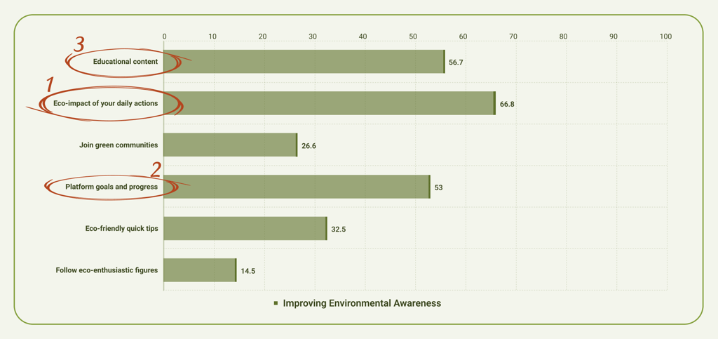
Of the application's informative features, these three were the most helpful, so we highlighted them in different sections of the website.
Survey
Understanding users' preferences
In the next step, we asked our target users the questionable points that we got from the second research with a small survey of 3 questions.
The results cleared 3 points that helped us how better introduce the LeafLife application.
Top Takeaways:
So it became clear that we should present smoothly how this platform's concepts increase user awareness by focusing on displaying the eco-impacts and helping to make and stick to a sustainable lifestyle.
Define
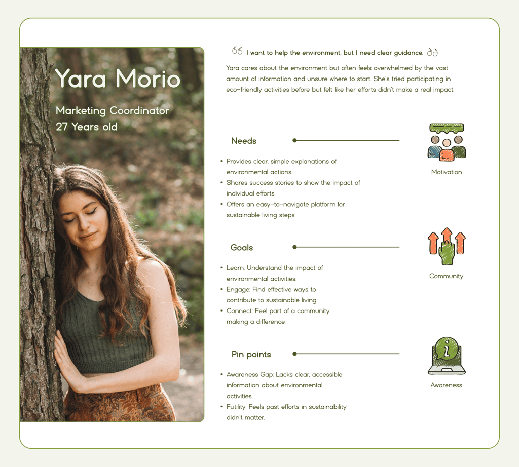
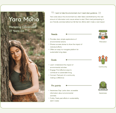
Representation of the target audience is captured by the data gathered in our research
Persona
Who is the user of the LeafLife website?
At this stage, summarizing the results of the research in a persona that was representative of our target users, helped us to get closer to our user's needs during the design process.
We often referred to our persona to ensure a user-centered focus throughout the project.
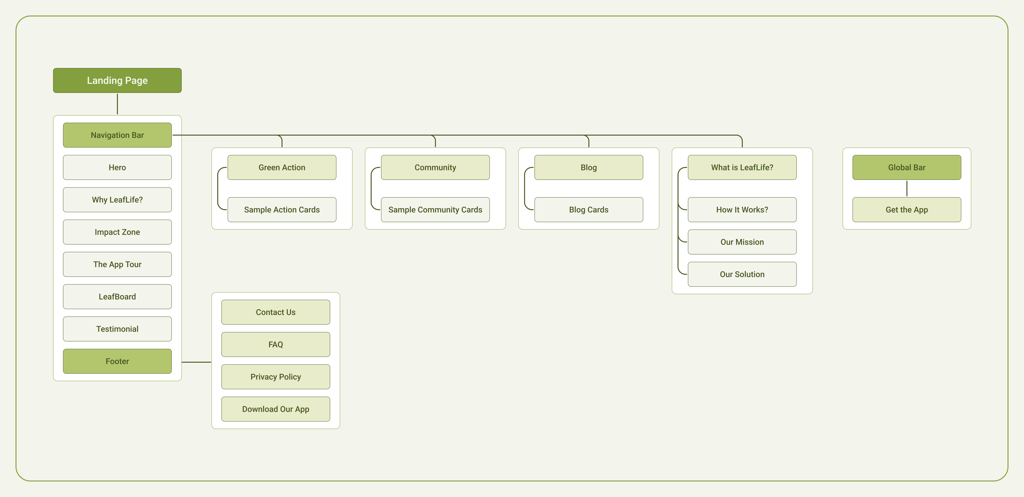
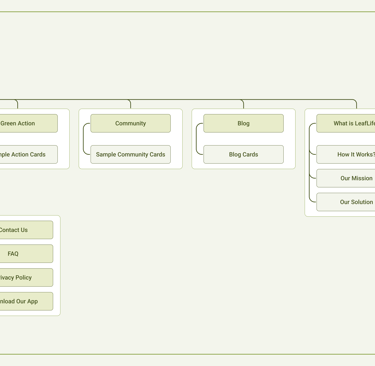
Final Sitemap diagram
Sitemap
How did we design the information architecture?
Based on our research findings, and multiple usability tests and iterations with target users, we developed the site map.
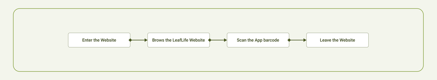
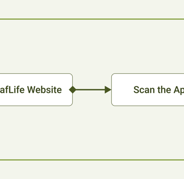
Task Flow
What steps does our user go through?
We created a Task flow for the persona. This gave us a clear picture of the steps that the user would need to take to get to the final goal.
Task Flow diagram
Ideate
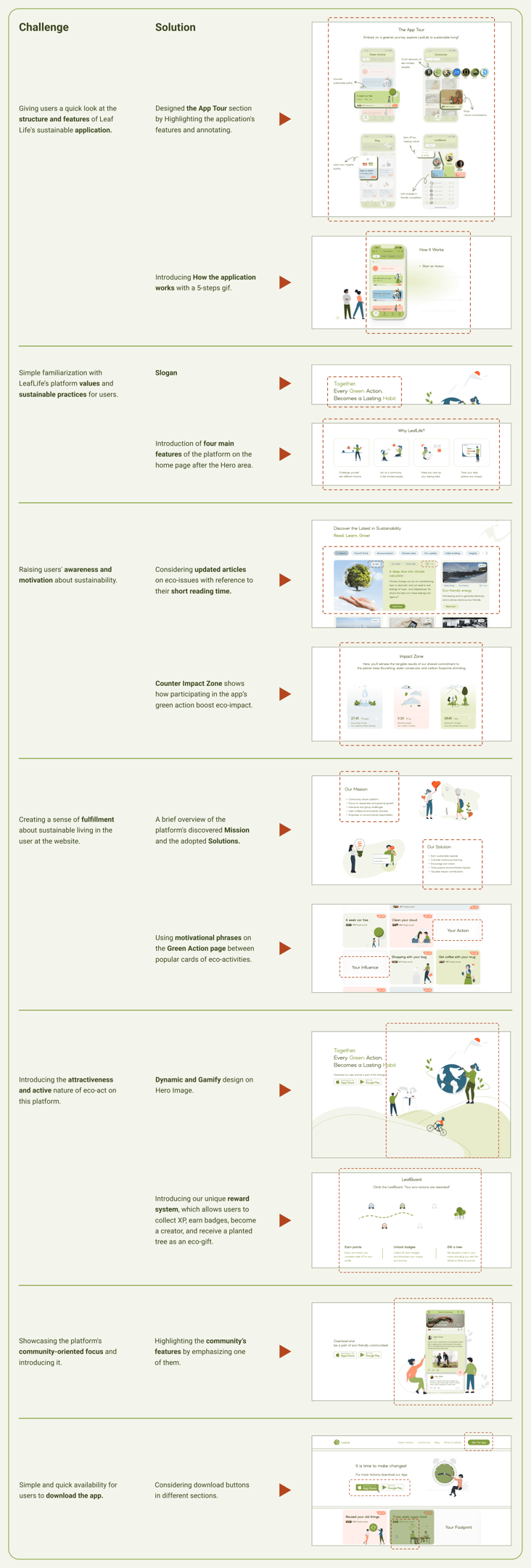
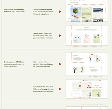
Challenges & Solutions
What design decisions did we make?
After analyzing all of our research, we began to understand projects challenges and tried to find a suitable solution to our design.
We created Low-fidelity wireframes on Figma to map out page layouts and design vision.
The wireframes went through a couple of rounds of iteration before the final content was developed.
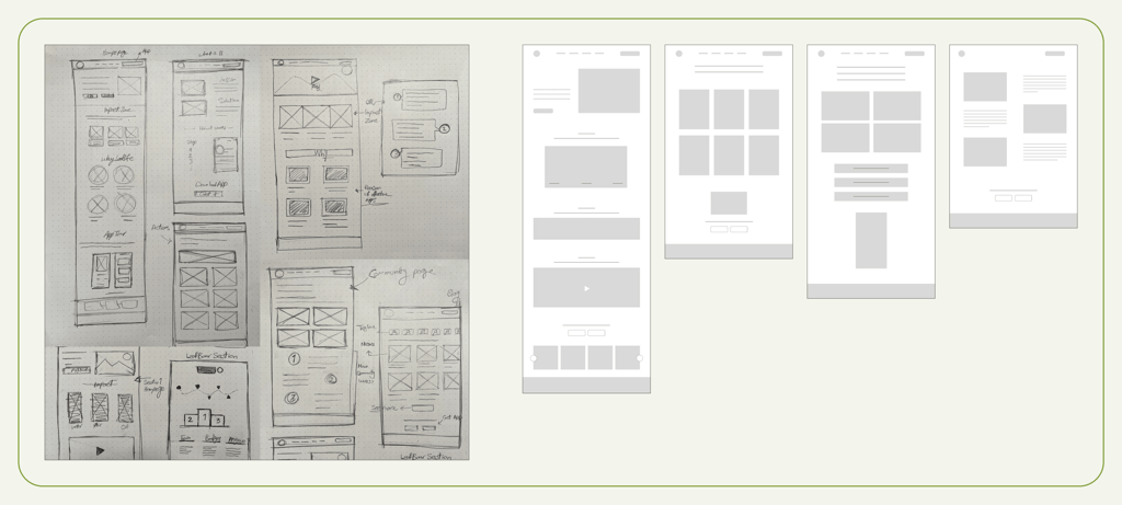
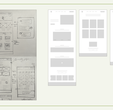
Sketches
How did we start our ideation?
We began by conducting brainstorming sessions with the team, using both paper and digital sketching tools to quickly capture and iterate on ideas.
Some early Sketches and Wireframes from our team
Mood Board
What can help us to be consistent?
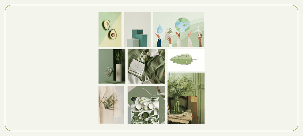
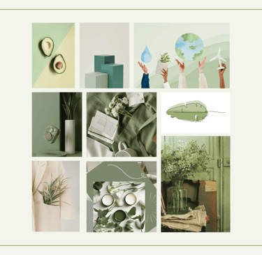
Considering that LeafLife is a united platform, we used the same Mood Board we made for the application design.
Our sustainability-inspired Mood Board
UI Kit
To design high-fidelity interfaces, we upgraded the LeafLife UI Kit, which includes colors, fonts, and element dimensions. These components were refined to ensure consistency across all screens, align with the website's requirements, and meet user needs.
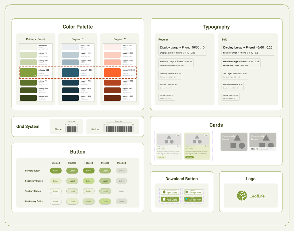
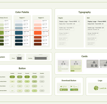
The LeafLife website UI Kit
UI Design direction
High Fidelity Prototype
Now it's time to take a quick look at our final high-fidelity designs, which are complete with colors and images!
Note: All the images are from google
Test
Phase 2
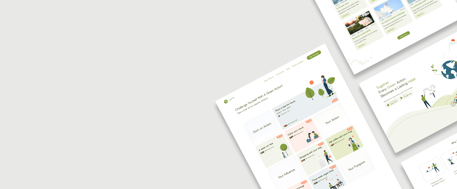
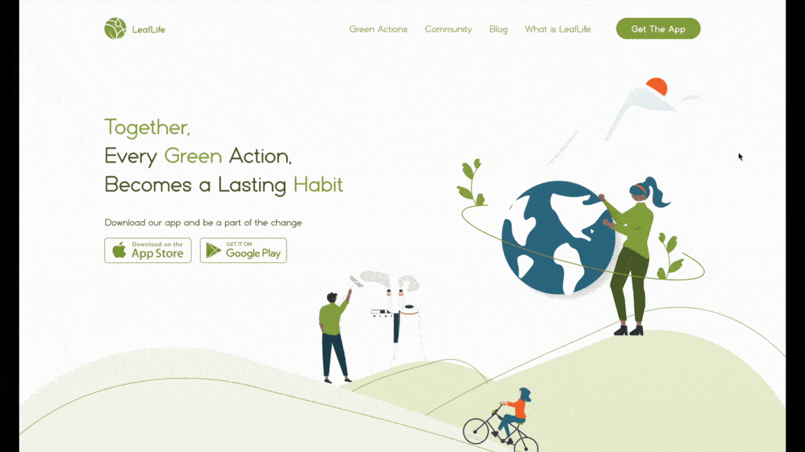
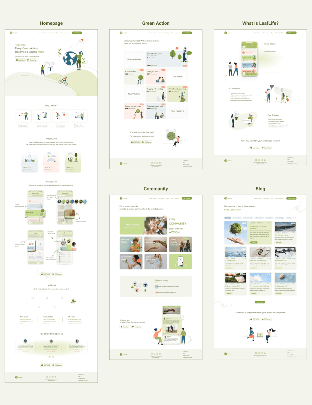
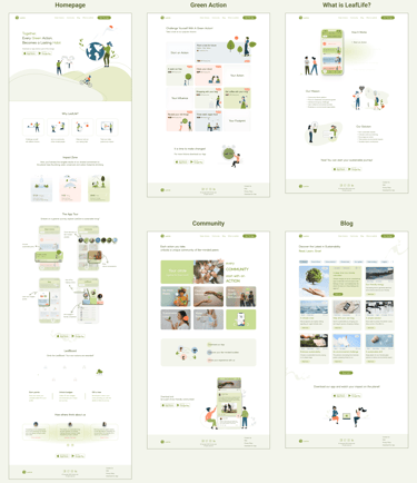
"Homepage"
"Green Action" Page
"What Is LeafLife?" Page
Mid-fid iteration of What is LeafLife?
Mid-fid iteration of Green Action
Mid-fid iteration of Homepage
Usability & Iteration
What did our stockholders & users think?
To reach the final version, in addition to numerous iterations within the team and stakeholders, we tested our expert and target users in three phases. Based on their feedback, we made changes to the designed pages, which are summarized below.
Phase 1: Heuristic evaluation (Mid-fidelity)
Phase 2: A/B Testing & Cognitive walkthrough
Phase 3: Assign Tasks
Phase 1
We conducted a heuristic evaluation of our mid-fidelity prototype to identify usability issues early in the design process. Evaluators used established principles to help us identify problems and areas for improvement. This feedback enabled us to refine the design before moving to the high-fidelity stage.
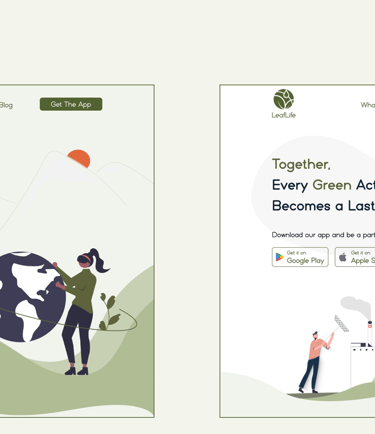
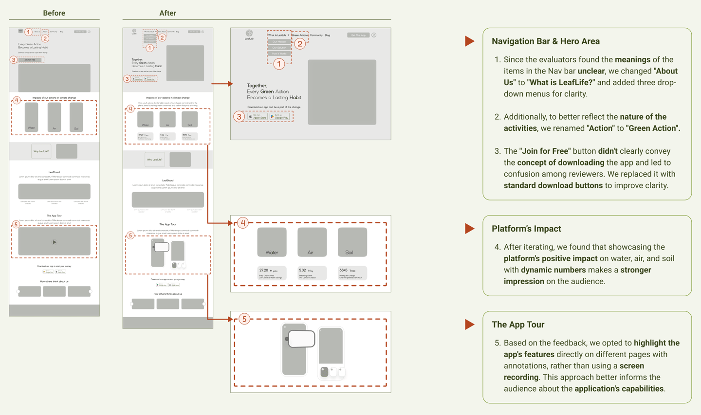
"Hero Area"
"Homepage"
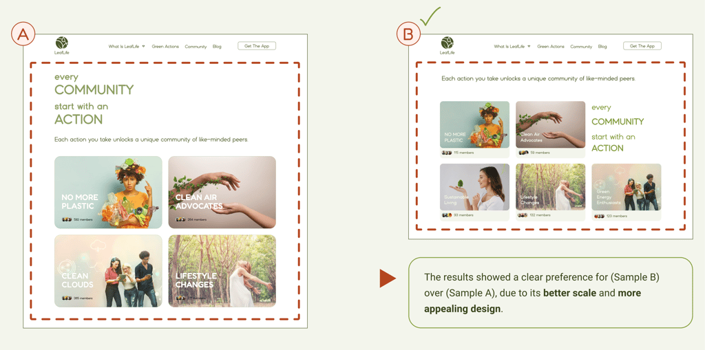
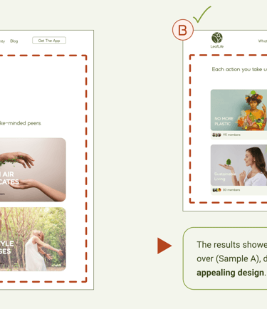
A/B Testing
After multiple ideations, a 13-participant A/B test was conducted to evaluate user satisfaction and functionality between two Community introduction section designs.
We then incorporated the feedback and recommendations into our final prototype.
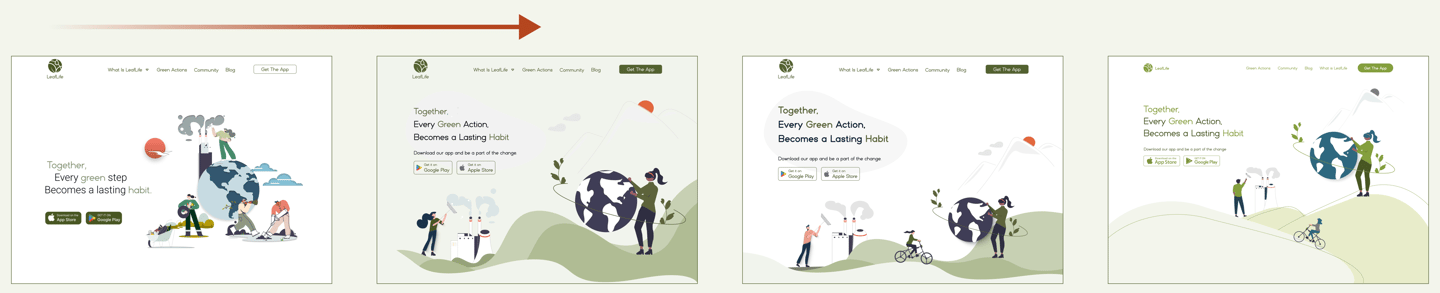
We went through multiple iterations to discover a hero image that instantly communicates our community-oriented platform’s core message: LeafLife helps concerned people turn green actions into lasting habits.
Some iteration of the Hero Area
The 2rd iteration of the high-fid Homepage
Phase 2
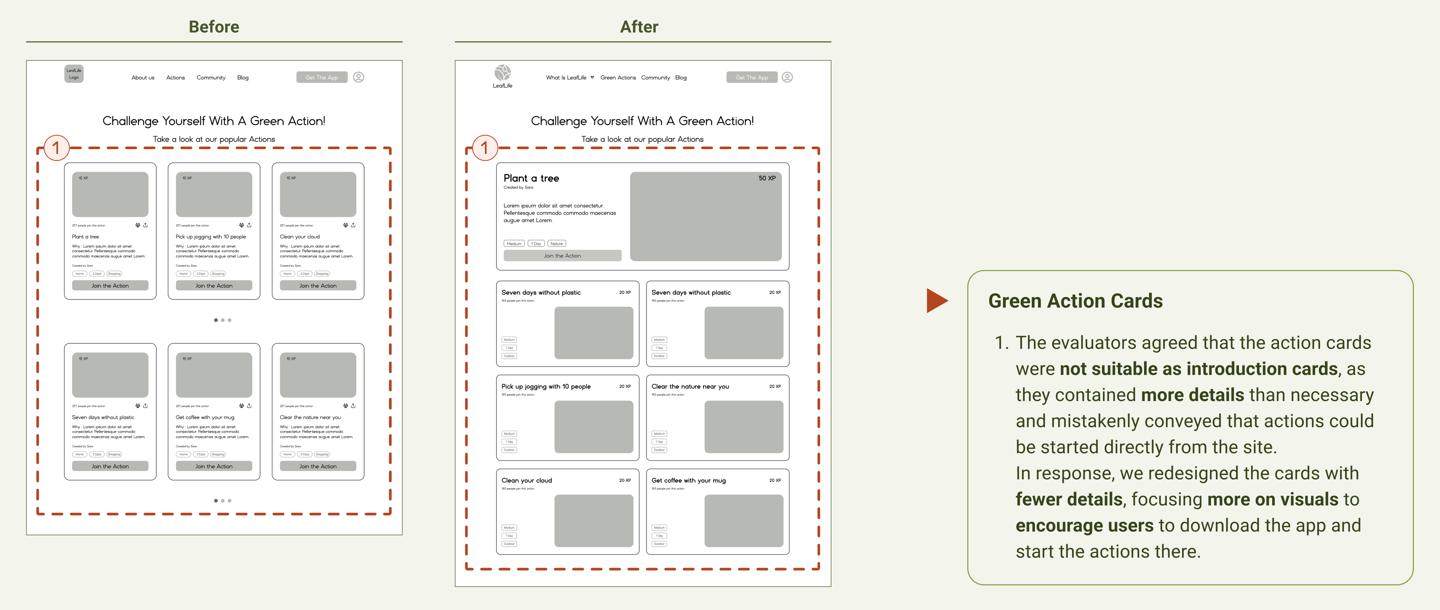
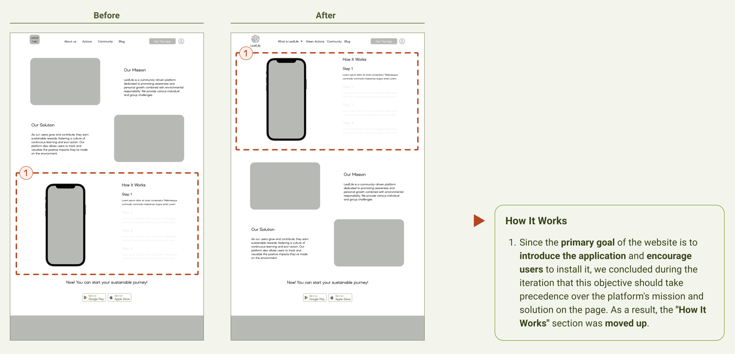
In this series of tests, we reached the following results by examining user behavior with the initial version of the high-fidelity design.
Community cards A/B Testing
Testing Tasks Cards
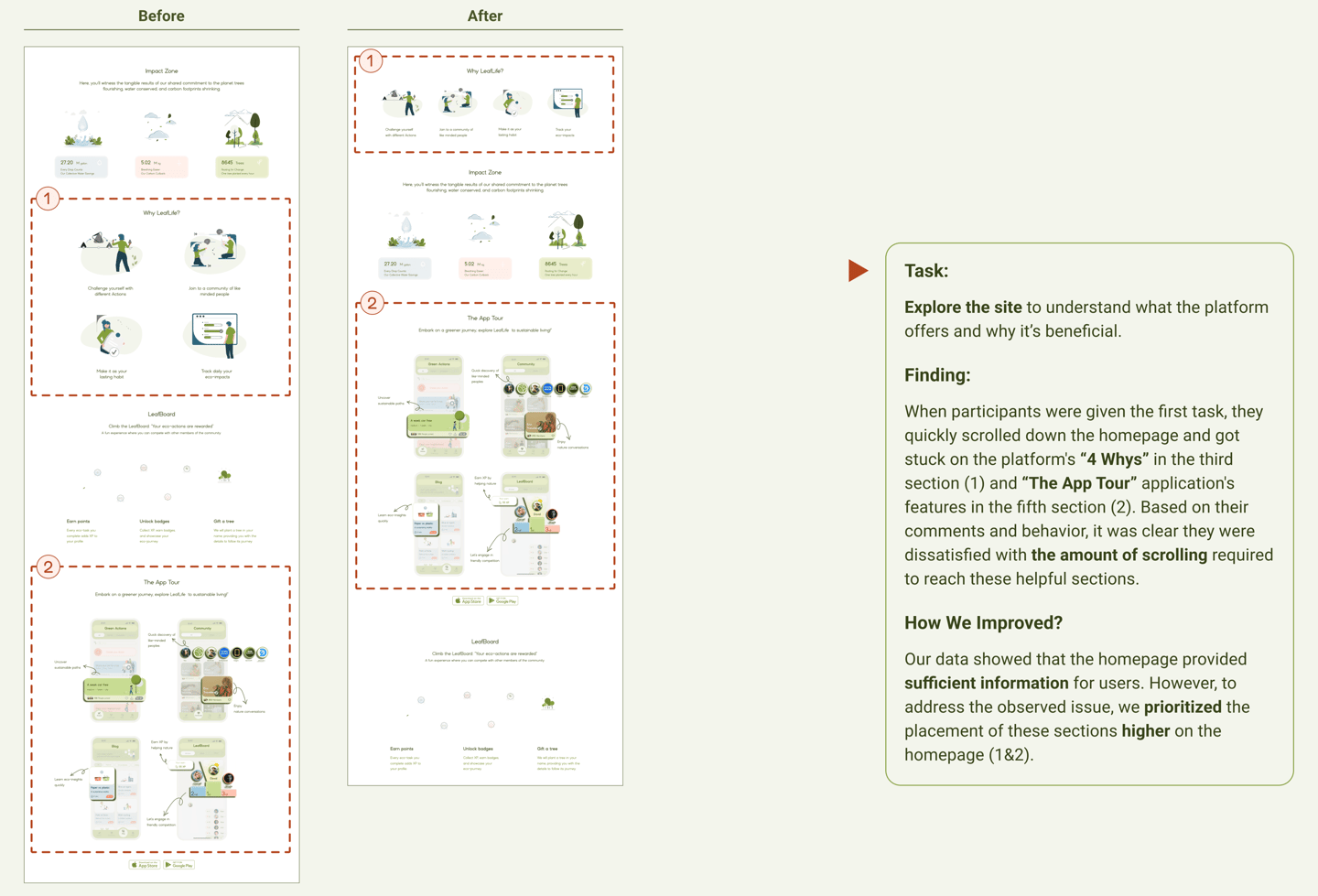
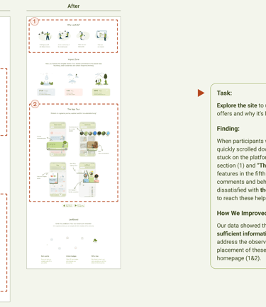
First Task Result
(Explore the website)
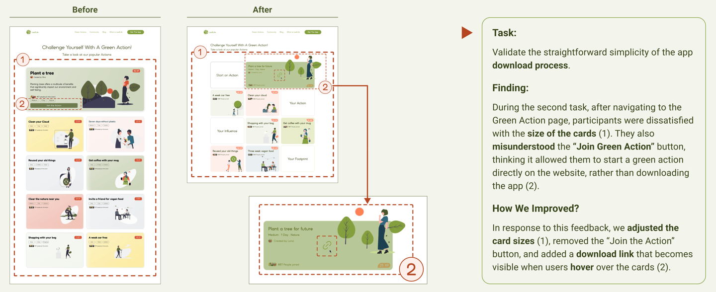
(Download process)
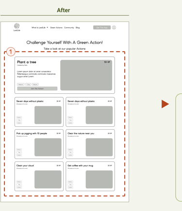
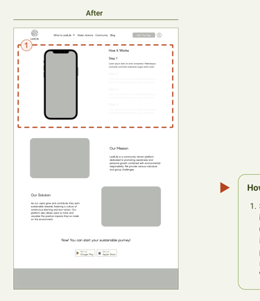
The 3rd iteration of the high-fid Homepage
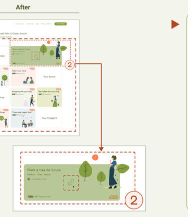
The 3rd iteration of the high-fid Green Action page
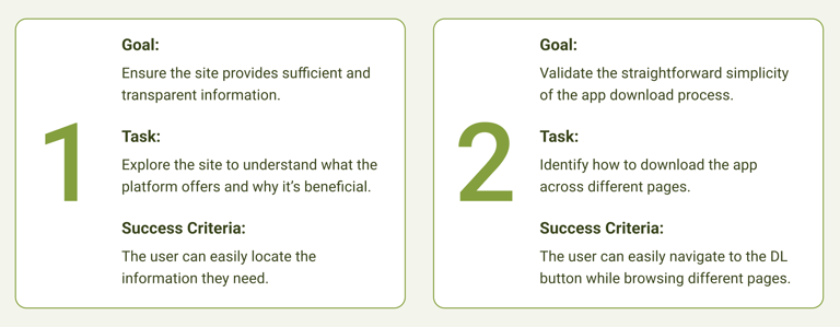
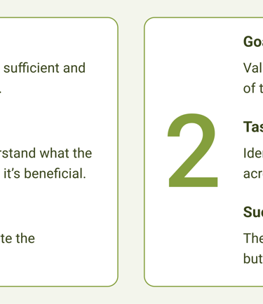
Phase 3
We tested our prototype with a total of 12 participants:
9 enthusiastic about eco-activities,
3 either unaware or uninterested in sustainability.
We assigned them 2 tasks to complete.
Second Task Result
Deliver
Click to visit the LeafLife app case study
Final Prototype
Here you can view the LeafLife final prototype on Figma.
Reflrction
What did I learn?
Being part of the team taught me the value of constant communication, especially in the early stages of a project.
Listening to users' feedback from the beginning can save significant time and effort.
I also gained insights into research techniques and methods for effectively presenting a product on a website.
What can we do next?
Develop a mobile-responsive version of the website for better accessibility on phones.
Focus on better introducing the Leafboard feature to users on the homepage.
Plan to enhance the website's accessibility to make it more user-friendly.