LeafLife
A green application to help the environment
Click to visit the LeafLife website case study
At a Glance
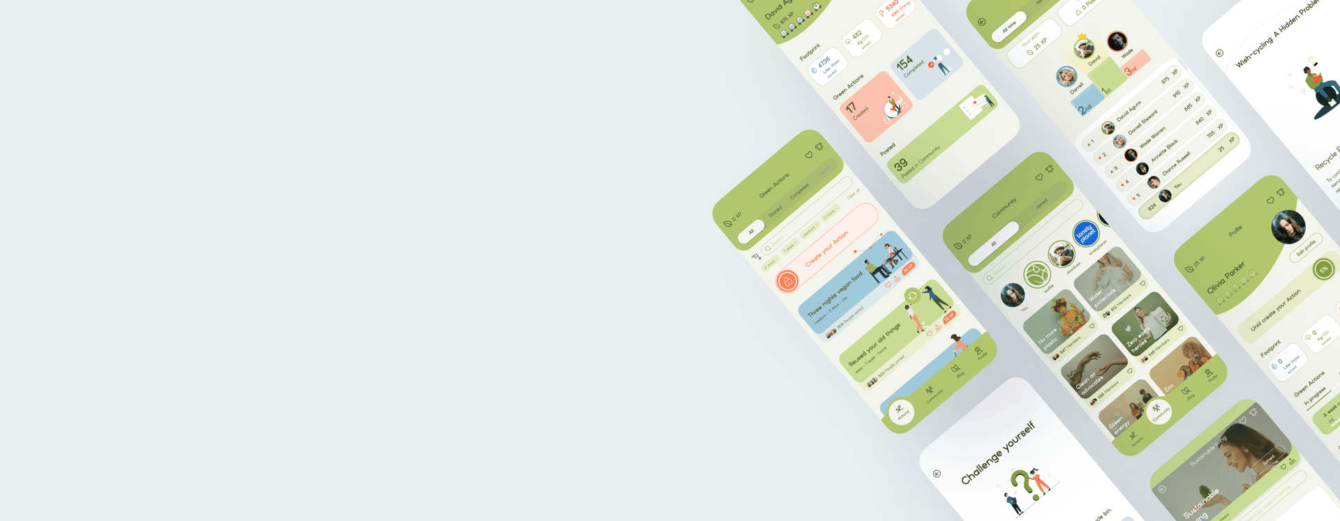
LeafLife is a community-centric website and mobile application dedicated to promoting environmental sustainability.
Our platform is committed to preserving the environment through the implementation of eco-friendly practices.

Project Overview
As a student at UXland, we were assigned to design a sustainable platform to help nature by joining likeminded people with these details:
Goal
Create a space for users to connect, motivate each other, and collectively commit to nature preservation.
Develop an app for community engagement, dynamic communication, and collaboration on environmental issues.
Stakeholder Needs
We started by defining a hypothetical stakeholder and determined its requirements and limitations in the first stage.
It is essential to address the growing disconnect between individuals and environmental commitment in today's fast-paced world.
The need for a supportive community that encourages users to engage in nature-centric actions must be identified and fulfilled.
2 Months - Part time

Duration
Team
Role
Tools




Group of Four
UX/UI Designer
Figma, Miro, Photoshop, AI, Maze, Zoom
Design Strategy
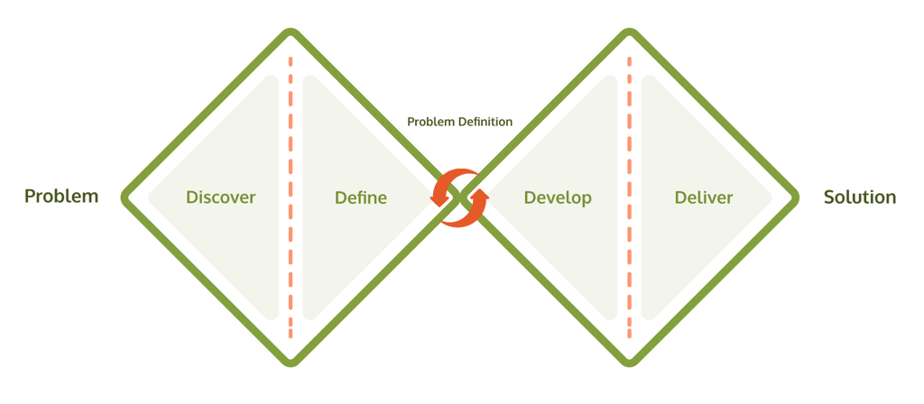
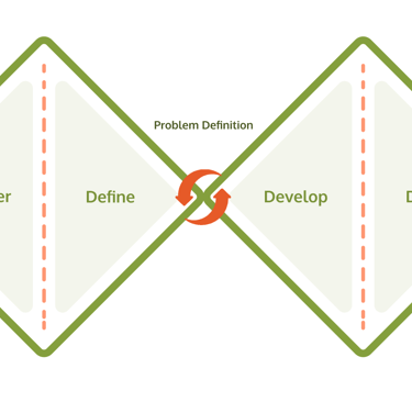
Our 8 weeks design sprint consisted of 4 phases, we took help from the double diamond method. there is no doubt that iteration is necessary during all phases.
_________
Discover
1
2
3
4
_________
_________
Define
Develop
Deliver
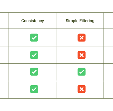
Competitive Analyses
Survey
Interview
Persona
Story Board
User Flow
Challenge & Solution
Sketching
Usability Testing (Phase 1)
Mood Board
UI Kit
Usability Testing (Phase 2)
High fidelity Prototype
Discover
Top Takeaways:
Focused on showcasing the environmental impact of users' actions (aligned with our strategy).
Developed targeted research questions to create the best filtering for the actions section.
Ensured visual consistency to remain competitive with other platforms.
Competitive Analysis
How are other Applications different?
Our goal was to identify the weaknesses of our competitors and clarify any uncertainties through surveys and interviews with potential users. This allowed us to turn those insights into strengths for our application.
Competitive Analysis table
To understand users' challenges and develop solutions, we used the following research methods:
Competitive Analysis
Online Survey
Interview & Affinity Diagram


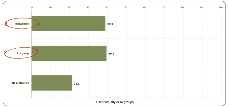
Remarkably, participants were almost equally interested in doing environmental activities individually and in groups.
Survey
Exploring users' needs and expectations
Our next step was sending out a 5-question survey to potential users to set our research on the right track, and we discovered 4 important points from 76 responses.
Top Takeaway:
On the one hand, these takeaways provide clear answers to our quantitative questions, helping us identify to-the-point solutions. On the other hand, they guide our next steps in interviews, allowing us to focus on specific issues and gain a deeper understanding of user problems.
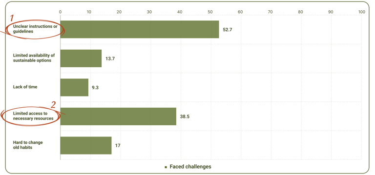
Respectively two main challenges they faced when adopting a green action were "Unclear instructions" and "Limited access to resources".
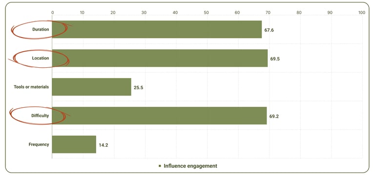
The three factors "Duration", "Location" and "Difficulty" have nearly equal influence on participants' decisions to engage in eco-friendly contributions.
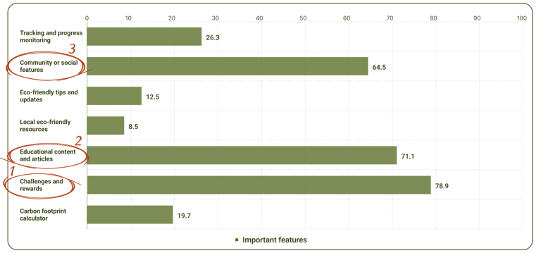
The features "Challenges and rewards", "Educational content and articles" and "Community or social features" determined the priority of features expected by our target users in an eco-friendly application.

Click to visit the LeafLife website case study
Based on the analysis of the collected data, users indicated facing the following five challenges during their sustainability activities.
Lack of awareness about environmental activities and their impact.
Feeling a sense of futility and discontinuity in past experiences.
Willingness to do eco-activities in the group.
The boring nature of eco-acts turns users off.
Unfamiliarity with the structure of platforms designed to support sustainable living.
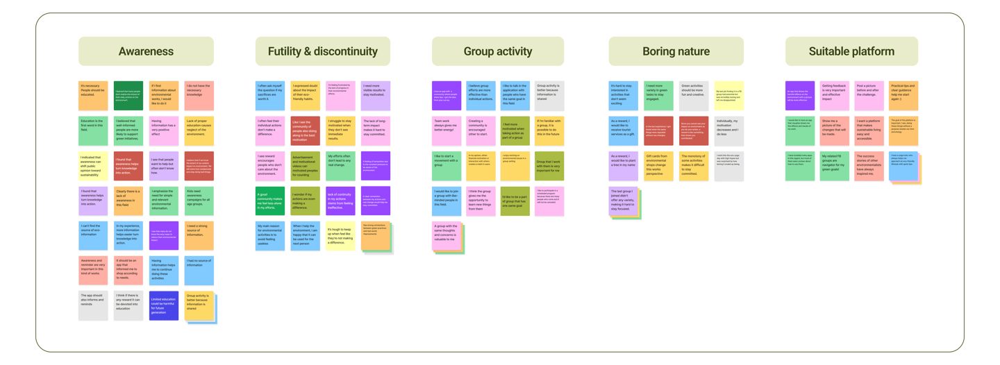
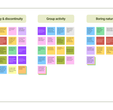
Affinity Diagram categories
Interview & Affinity Diagram
Understanding users' problems
Then we contacted 19 participants to understand their pain points better and meet their preferences from the users' perspective.
Top Takeaways:
So, we decided to focus on a practical approach in the application at this stage, and then, for platform expansion, shift our attention to motivating and informing users on the website.
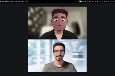

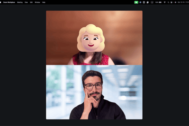

Some screenshots from the interviews
Define
Representation of the target audience according to our research
Persona
Who is the user of the LeafLife application?
Since one of the key findings from our user research was the fact that users need comfort community to share and achieve Up-to-date environmental information, a user persona is created.
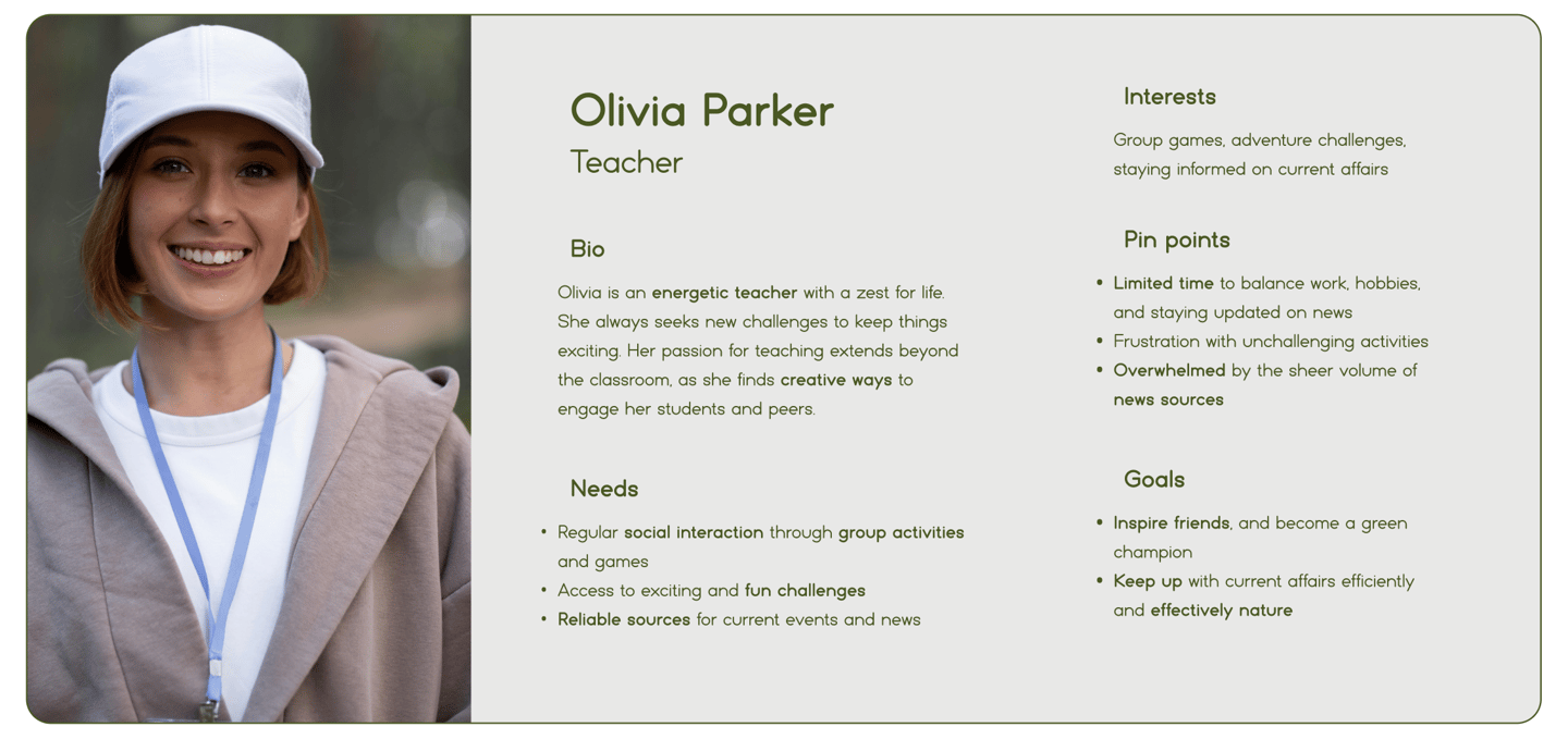
We revisited the user persona often to remind ourselves of the needs and frustration of users and to maintain a user-centric focus for the duration of the project.

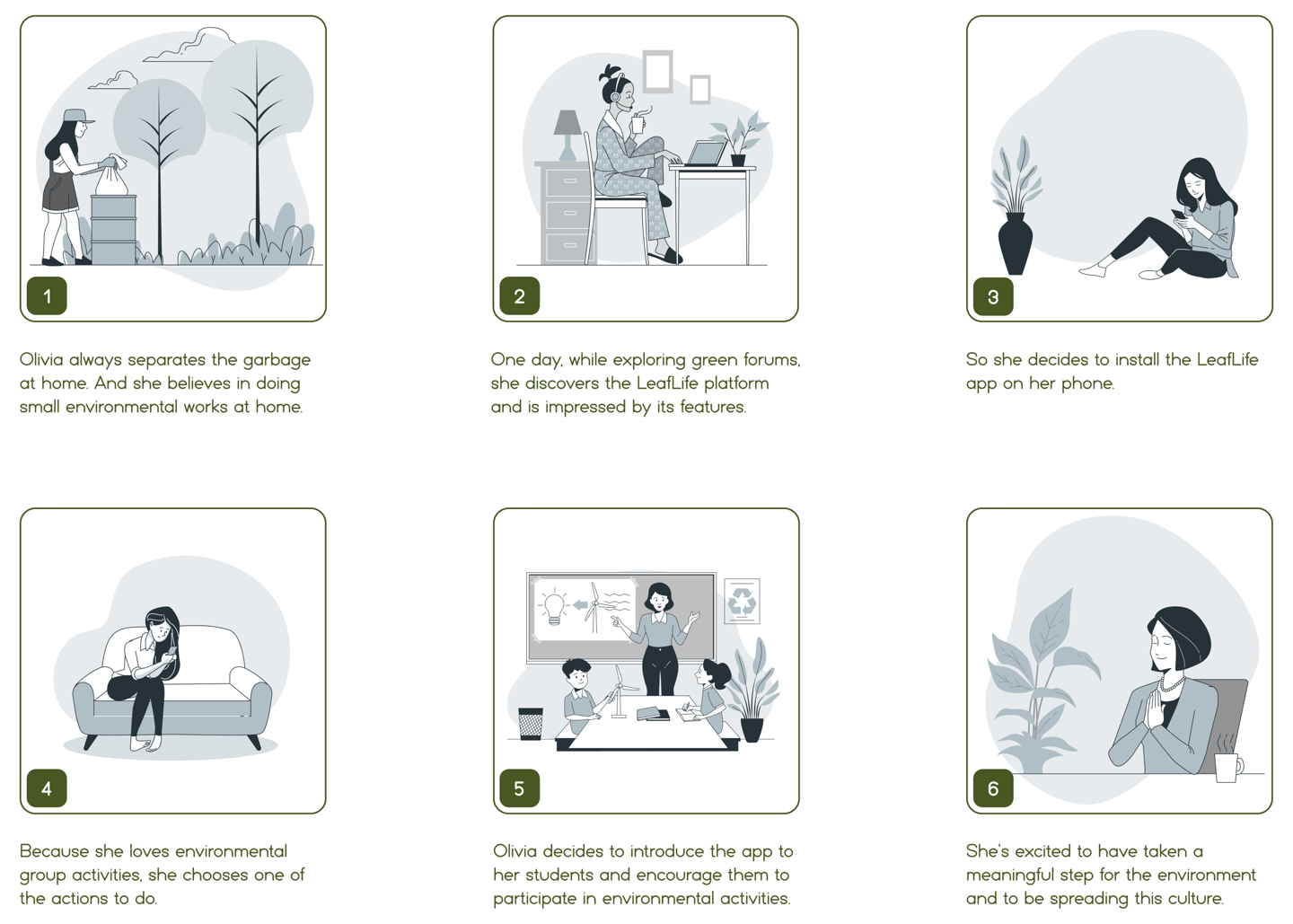
Story Board
What journey has our persona experienced so far?

User Flow
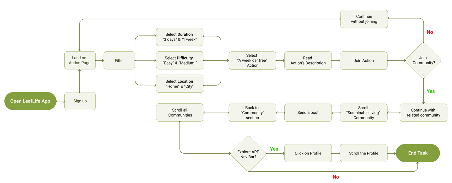
What steps does our persona go through?
In the next step, we created a user flow to outline the steps our persona would take while completing the specified task, giving us a clear framework for the design process.
User Flow diagram
Develop
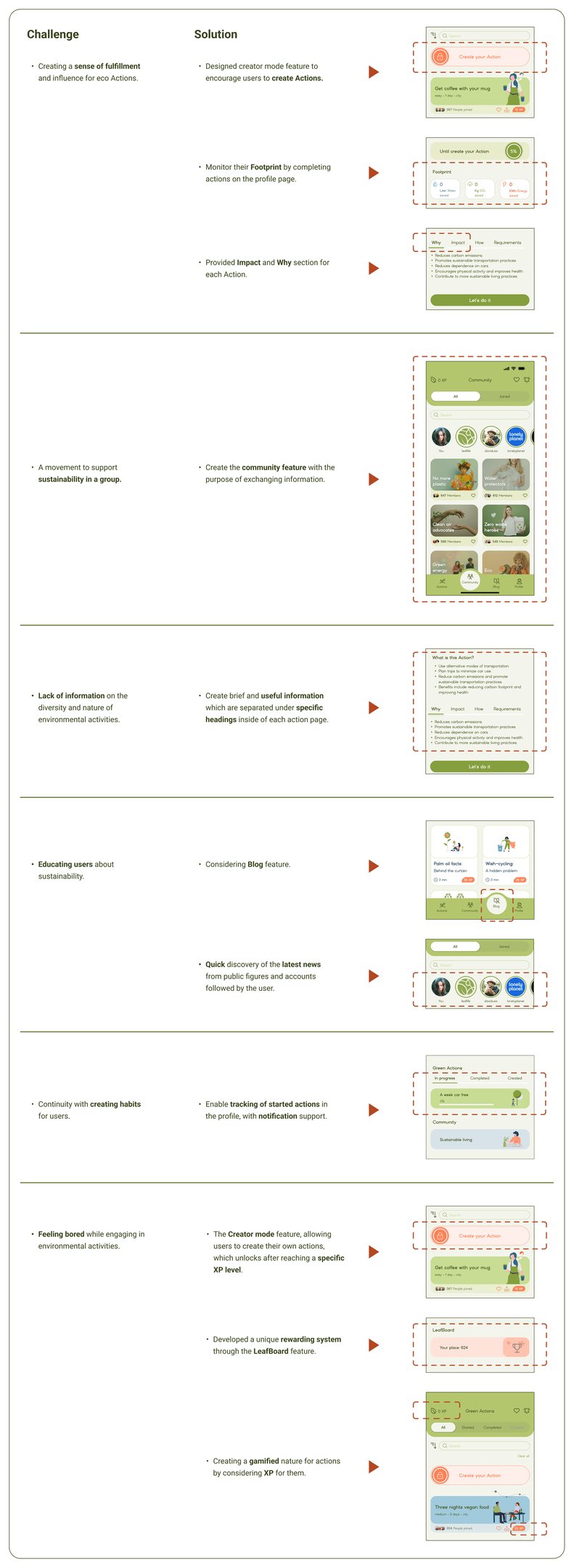
Challenges & Solutions
What design decisions did we make?
After concluding our research, we identified key challenges our users faced and worked to address them through thoughtful design solutions.
The before-and-after images highlight how our design progressed to overcome these challenges.

Sketches
How did we start our ideation?
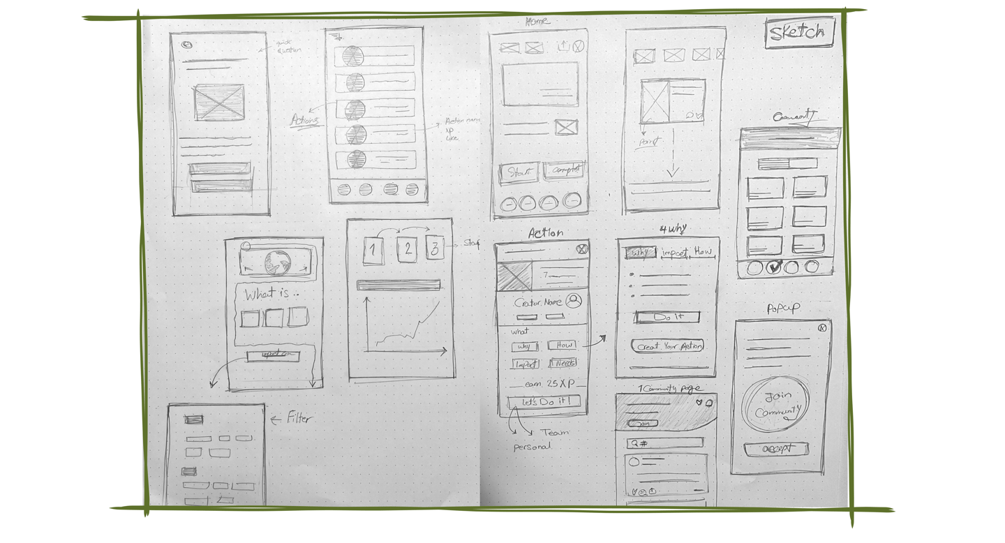
We started with team brainstorming sessions, using a mix of paper and digital sketches so we could quickly generate and discuss ideas.
Some early Sketches from our team

Mid-fid iteration of Landing page
Usability & Iteration
What did our stockholders & users think?
After several iterations involving the team, stakeholders, and target users, we arrived at the final version. Based on their feedback, we made revisions to the designed pages, which are summarized in the two sections below.
Phase 1: Heuristic evaluation (Mid-fidelity)
Phase 2: Assign Tasks & A/B Testing (After applying UI-Kit)
Phase 1
We carried out a heuristic evaluation of our mid-fidelity prototype to uncover usability issues at an early stage of the design process, before entering the high-fidelity phase. By applying established principles, the evaluators helped us pinpoint problems and areas for enhancement.
"Landing page"
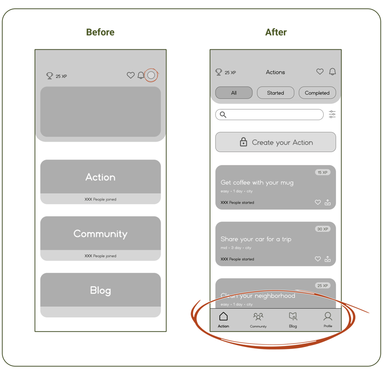
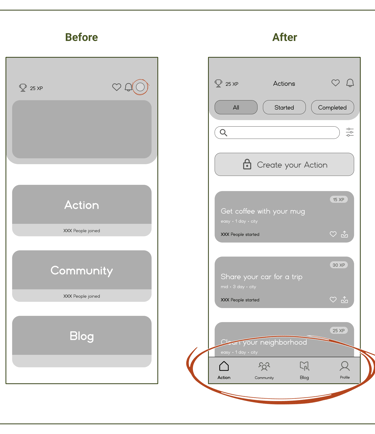
Based on the evaluators' feedback, we merged the actions page with the landing page to simplify the user experience and save time. Additionally, we added a 4-icon navigation bar (Including the profile) at the bottom of the pages to make it easier for users to quickly switch between different sections.
"Community"
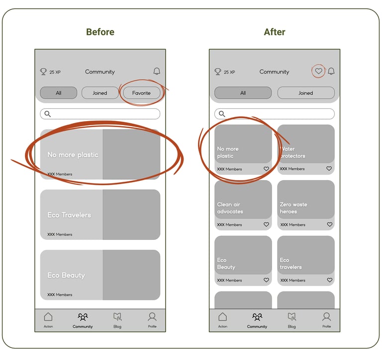
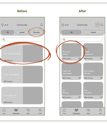
We considered the evaluators' suggestions that large cards on this page caused users to scroll more to view different communities. As a result, we resized the cards, allowing nearly twice as many to fit on each page.
Also, to improve access to the favorites section across all pages, we removed its button from the main interface and moved it to the top bar.
Mid-fid iteration of Community
"Profile"
Lastly, we updated the actions section on the profile page to improve the user experience in accessing their activity.
Additionally, we added a progress bar with percentages in two sections to help users better understand;
- how close they are to becoming an action creator and,
- how much progress is left in the actions they have taken.
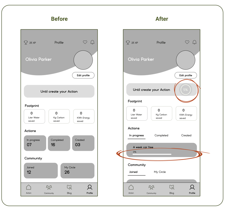
Mid-fid iteration of Profile
Deliver

Mood Board
What can help us to be consistent?
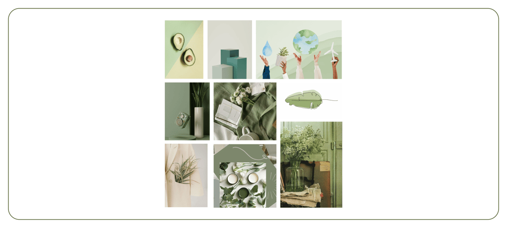
Since LeafLife is a green platform, the team chose a calm and peaceful mood board to guide the ideation and creation of a fitting color palette, reflecting the app’s eco-friendly focus and promoting a sense of harmony.
Our sustainability-inspired Mood Board
UI Kit
To create polished, high-quality app interfaces, we expanded the LeafLife UI Kit. These elements were carefully optimized and iterated multiple times to maintain visual consistency, meet the app’s functional needs, and deliver a smooth user experience.
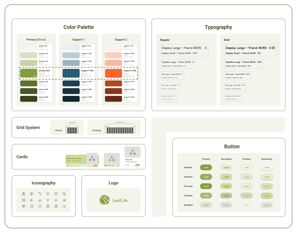
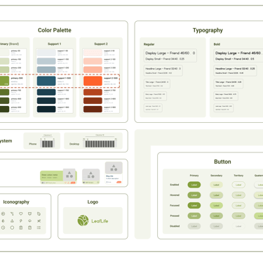
The LeafLife application UI Kit
UI Design direction

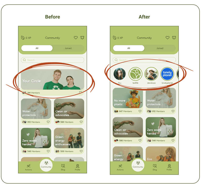
High-fid iteration of Community
Usability & Iteration
Phase 2
This section highlights the changes made after repeatedly testing various tasks following the application of the UI kit.
"Community"
At first, users were confused and thought that "Your Circle" was the same as other communities.
Based on their feedback, we redesigned the layout, displaying each post in circular formats with the profile picture of the person who posted it, arranged by time priority.
"Community posts"
Since each community is linked to multiple challenges, we assigned a unique hashtag to each action to help users read specific messages or posts related to that action.
However, during testing, we noticed that users had difficulty finding the correct hashtags. To simplify this process and remove the need for users to remember hashtags, we introduced a suggestion system in both the community search and posting sections.
This system suggests relevant hashtags based on "actions the user has previously selected" and "those related to the chosen community".
As a result, users can easily select the appropriate hashtags from the list.
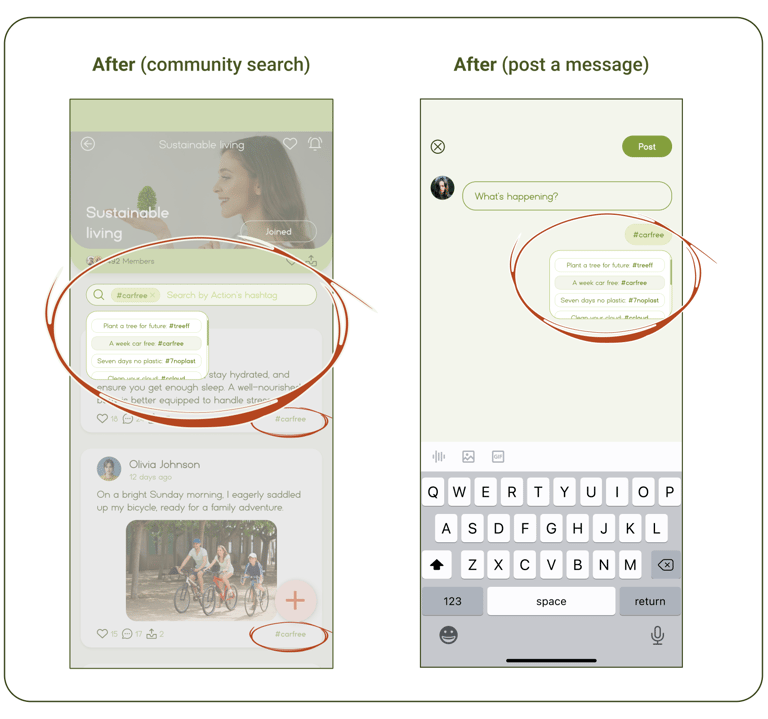
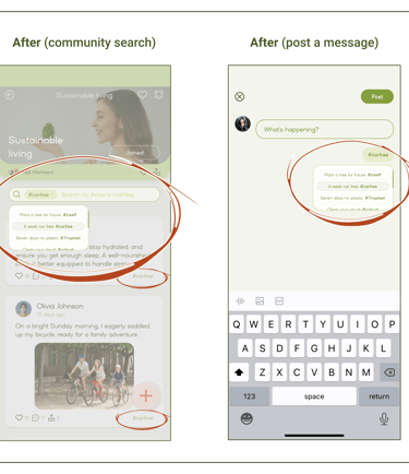
High-fid iteration of Searching & Posting
A/B Testing
"Green Action description"
To determine the best way to present the description of an action, two different designs were tested with 16 participants.
As a result, design A was chosen by a higher percentage of users for its simple accessibility.
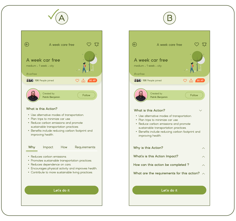
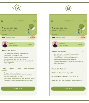
An action description A/B Testing

High Fidelity Prototype
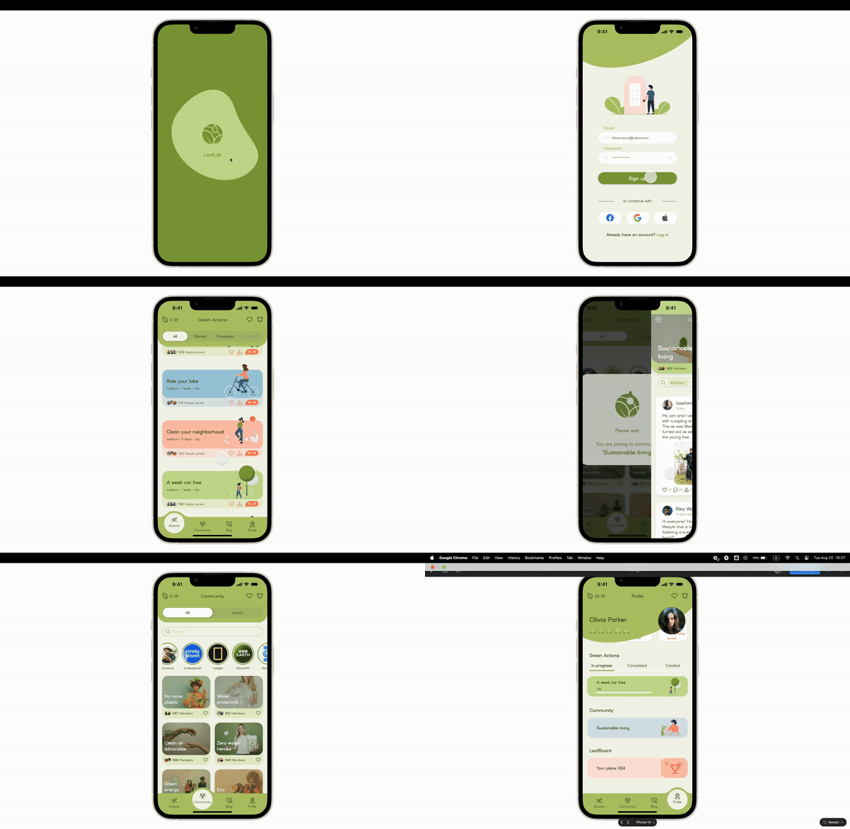
Now it's time to take a quick look at our final high-fidelity designs, which are complete with colors and images!
Note: All the images are from google
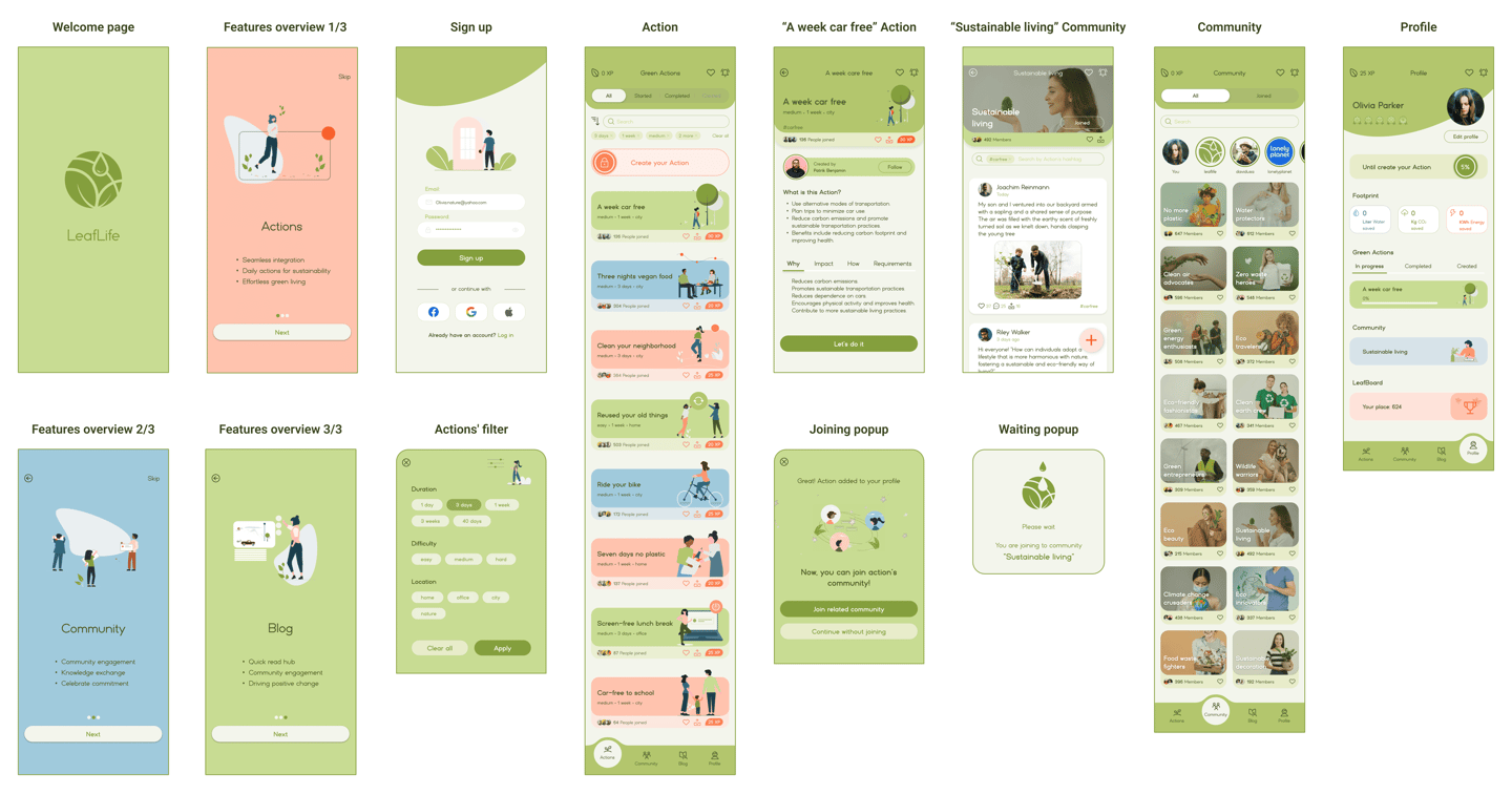
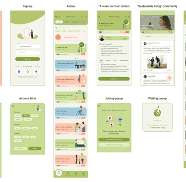
Here you can view the final prototype on Figma.
Click to visit the LeafLife website case study
Reflection
What did I learn?
How to translate research into features that meet user needs and refine versions through testing.
The value of constant communication within a team, especially early in the project.
How to design an application while considering the scale of different elements.
What's next?
Develop the Blog section based on the insights gathered from our research.
Plan to design a dark version of the application, keeping accessibility in mind.
Finalize the Leafboard features by incorporating user feedback.

