Caffe Yoga
Redesign the website of a unique yoga studio
At a Glance
Caffe Yoga, a unique studio in Orange County, provides a welcoming, home-like atmosphere. In recent years, due to increased demand, it has focused on improving customer bookings through a seamless, user-friendly website experience.
Our team made a focused effort to redesign the website, concentrating on improving its information architecture. We developed high-fidelity wireframes, refining each screen to create a smooth click-through prototype.


Project Overview
As a volunteer project, our team efficiently redesigned the Caffe Yoga website, even though we couldn't dedicate the full duration to it.
Goal
Redesign the Caffe Yoga website to increase user enthusiasm for registration.
Organize content more effectively, making it easier for users to find information about classes, pricing, and instructors while ensuring smooth navigation.
Problem statement
The Caffe Yoga website struggled to clearly present the studio's services and offered a complicated booking process across various sections. To improve engagement, stakeholders saw the need for a modern, inviting website that would better reflect the studio's brand and deliver an improved user experience for booking classes.
1 Month - Part time
Duration
Team
My Role
Tools


Group of Three
UX/UI Designer
Figma, Miro, Photoshop, Maze, Zoom
Task
Overhaul the information architecture by focusing on the booking process through the class menu and enhancing the visual design to create a more user-friendly interface.
Design Process
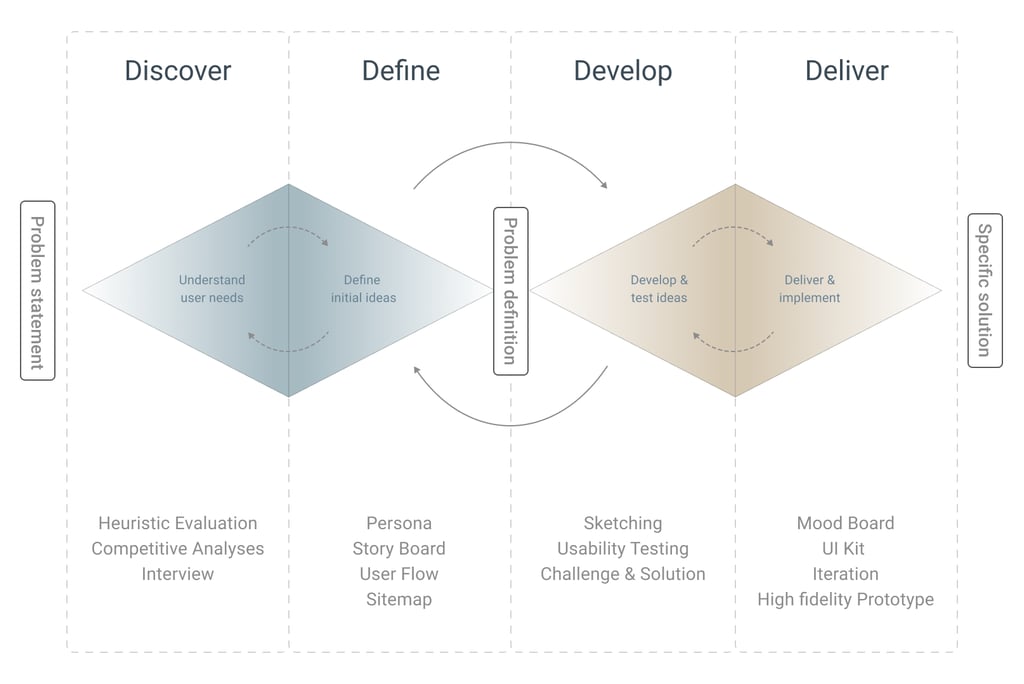
Our team of three followed the Double Diamond framework, based on Design Thinking methodology. The process was non-linear, as we often revisited and iterated between stages throughout the project's progression.
Discover
What did we find?
Users experienced difficulty navigating the site.
(Efficiency of use and system status)
Misalignment and imbalance between the hero image and text compromised the visual experience.
(Aesthetic and minimalist design)
Icons lacked consistency with user expectations.
(System status and recognition)
Overly text-heavy pages with long line lengths made readability difficult.
(Aesthetic and minimalist design)
Inconsistent layouts across different pages disrupted the user experience.
(Design continuity and standards)
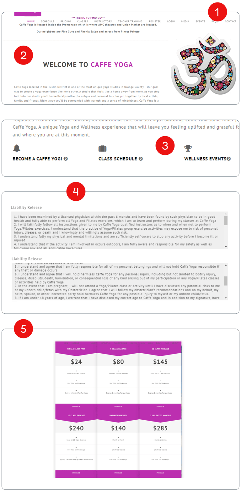
Heuristic Evaluation
In the initial phase of the redesign, our team of four conducted a heuristic evaluation of the website to identify key issues and gain insight into areas to focus on during user research.
The website's design and content were outdated, and several usability issues were identified.
Examples of issues found on the old website.
Our research enables us to go beyond users' immediate frustrations, allowing us to analyze their hopes, fears, abilities, limitations, reasoning, and goals. From these insights, we can later develop solutions grounded in a comprehensive understanding of their needs.
Research Methods
Heuristic Evaluation
Competitive Analysis
Interview & Affinity Diagram
What can we do?
Create a well-structured information architecture to ensure a seamless and intuitive user experience.
Redesign the hero section to maintain visual balance and ensure relevant and visually appealing imagery.
Implement a consistent icon set, aligning iconography with user expectations for better clarity.
Incorporate visuals and bullet points to break up long text, enhancing readability and engagement.
Develop a cohesive UI kit and apply it across the entire site to ensure uniformity and strengthen the brand connection.
As we analyzed competitor websites, we discovered that the "Caffe Yoga" site lacked several key features. This comparison helped us identify the strengths of competitor offerings and uncover both threats and opportunities for improvement.
Competitive Analyses
We conducted thorough research on potential competitors, reviewing four websites that are similar to "Caffe Yoga" and specifically target the yoga community.
Threats:
Competitors offer better navigation, leading to a potential reduction in members.
Lack of accessibility features limits Caffe Yoga's audience.
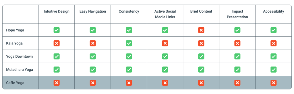
Opportunities:
Improving navigation can help Caffe Yoga stand out from competitors.
Simplifying content can attract users frustrated by text-heavy sites.
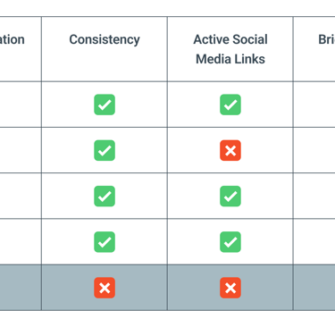
Competitive Analysis table
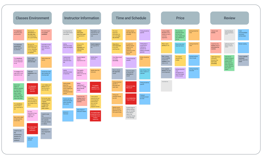
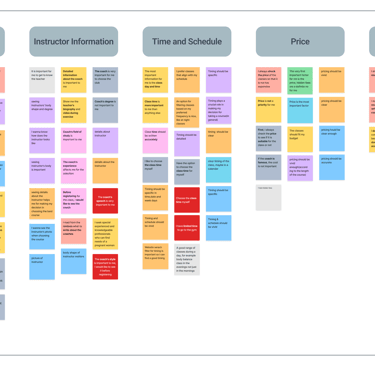
Affinity Diagram categories
Interview & Affinity Diagram
We identified potential users and conducted research by asking targeted questions to reveal hidden insights. Through interviews with 14 participants, we gained a deeper understanding of their pain points.
Top Insights:
Based on our study, potential users identified three key priorities that we will focus on at this stage.
The classroom environment should be clean and calming.
Coaches' information is important for establishing their professionalism.
Clear schedules and class information facilitate quick decision-making.
These insights will guide our efforts to enhance the user experience at Caffe Yoga.
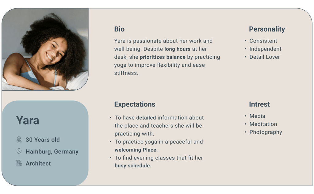
Define
Representation of the target audience according to our research
Persona
Who is the user of the Caffe Yoga website?
To define design tasks and effectively communicate the user insights gathered during research, we developed a persona and scenario. This ensured a consistent approach among team members throughout the project.
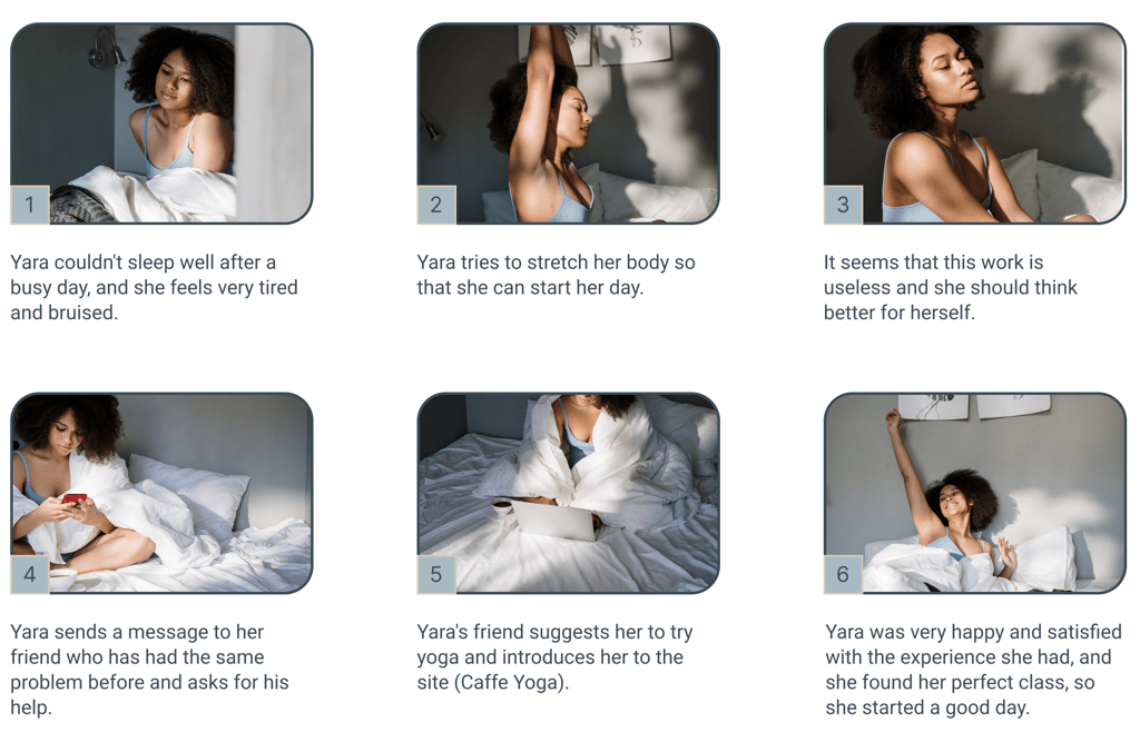
Story Board
What has been the persona’s journey?
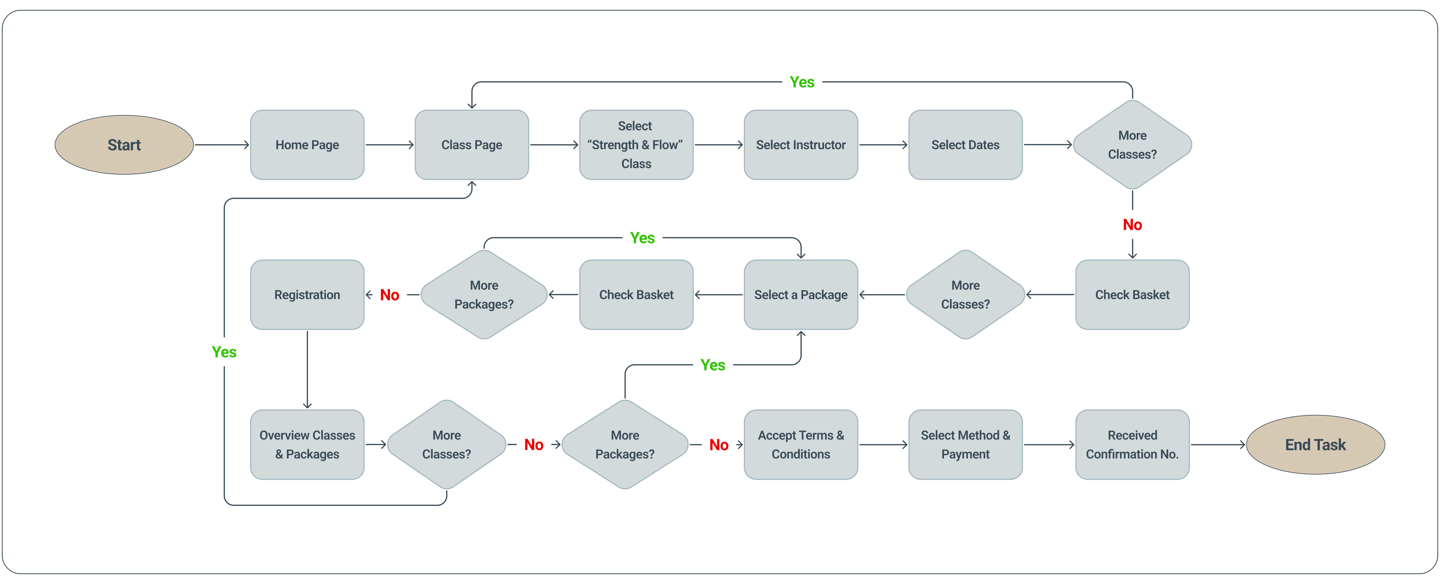
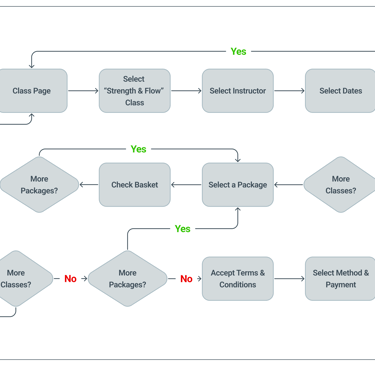
User Flow
What steps does our persona go through?
Next, we designed a user flow to map out the steps our persona would take to complete the task, providing us with a clear structure for the design process.
User Flow diagram
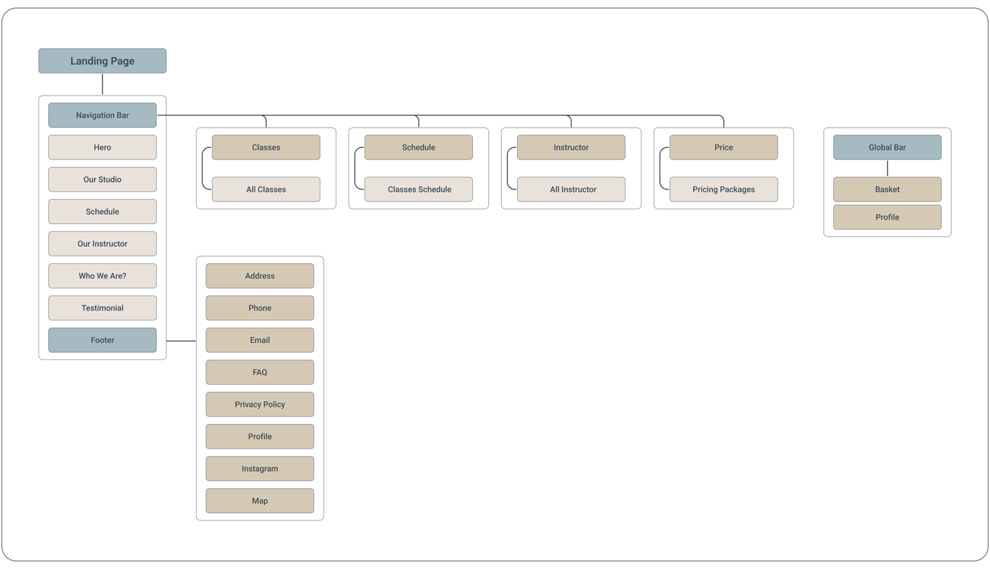
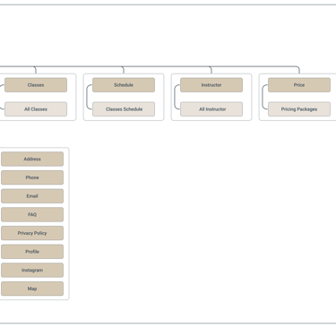
Sitemap
How did we design the information architecture?
In the final step of defining the project, we used our research findings, along with multiple iterations with the team and target users, to create the site map.
Sitemap diagram
Develop
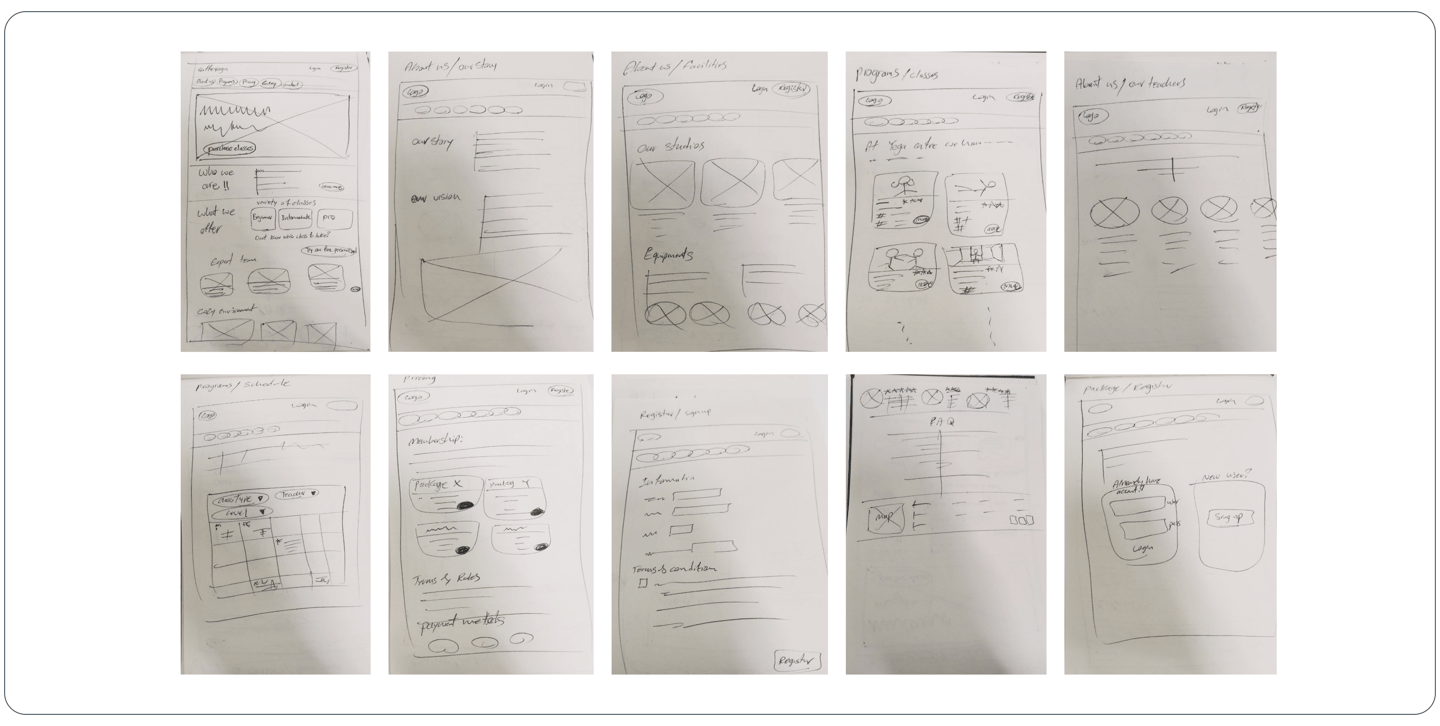
Sketches
How did we start our ideation?
We hand-sketched low-fidelity wireframes to visually outline our ideas, which helped the design process and improved communication within the team during the early stages.
Some Sketches from our team
After several rounds of iteration with input from the team, stakeholders, and target users, we finalized the design. Their feedback guided us in revising the pages, allowing us to move forward to the final step.
Wireframe Usability Testing
What did our stockholders & users think?
To improve efficiency and ensure the design is better aligned with user needs, we decided to conduct multiple testing stages during the wireframe phase prior to applying the UI Kit.
This approach helped us refine the design early on and avoid delays by reducing the need for revisions after implementing colors and images. Below are some key changes that were made during this process.
1- Navigation Bar
We initially developed the navigation bar based on research insights. However, after multiple discussions with stakeholders and revisiting the research, we have made the following changes;
The "About Us" content was covered through the "Our Studio" and "Who We Are?" sections.
Delete "Program" and add its drop-down menu to the nav bar as "Class" and "Schedule".
For quick access, we placed the "Contact" info in a narrow bar at the top of the home page.
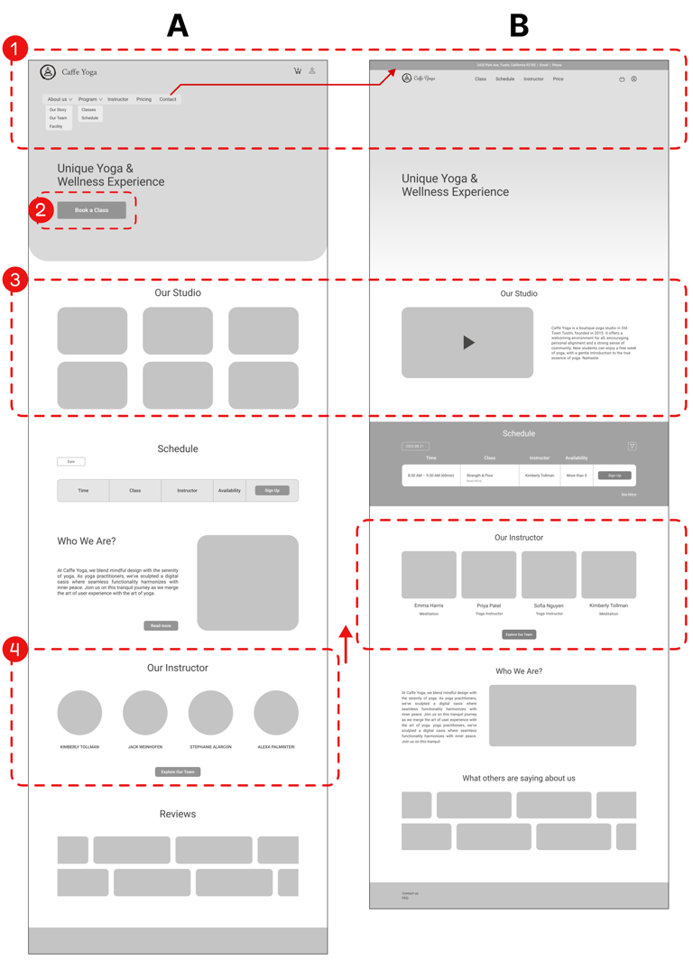
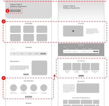
Homepage
2- "Book a Class" button
Initially, we prioritized access to the class page by placing the "Class button" in the hero section.
However, after two rounds of testing, we discovered that users preferred accessing it via the navigation bar.
3- Our Studio
Based on stakeholder feedback and users' preferences, we concluded that a video showcasing the studio’s environment and facilities would have a greater impact on brand recognition and building user trust compared to a series of photos.
4- Our Instructor
Based on user priorities, the team decided to move the instructor section higher on the homepage to make it easier to find.
Classes
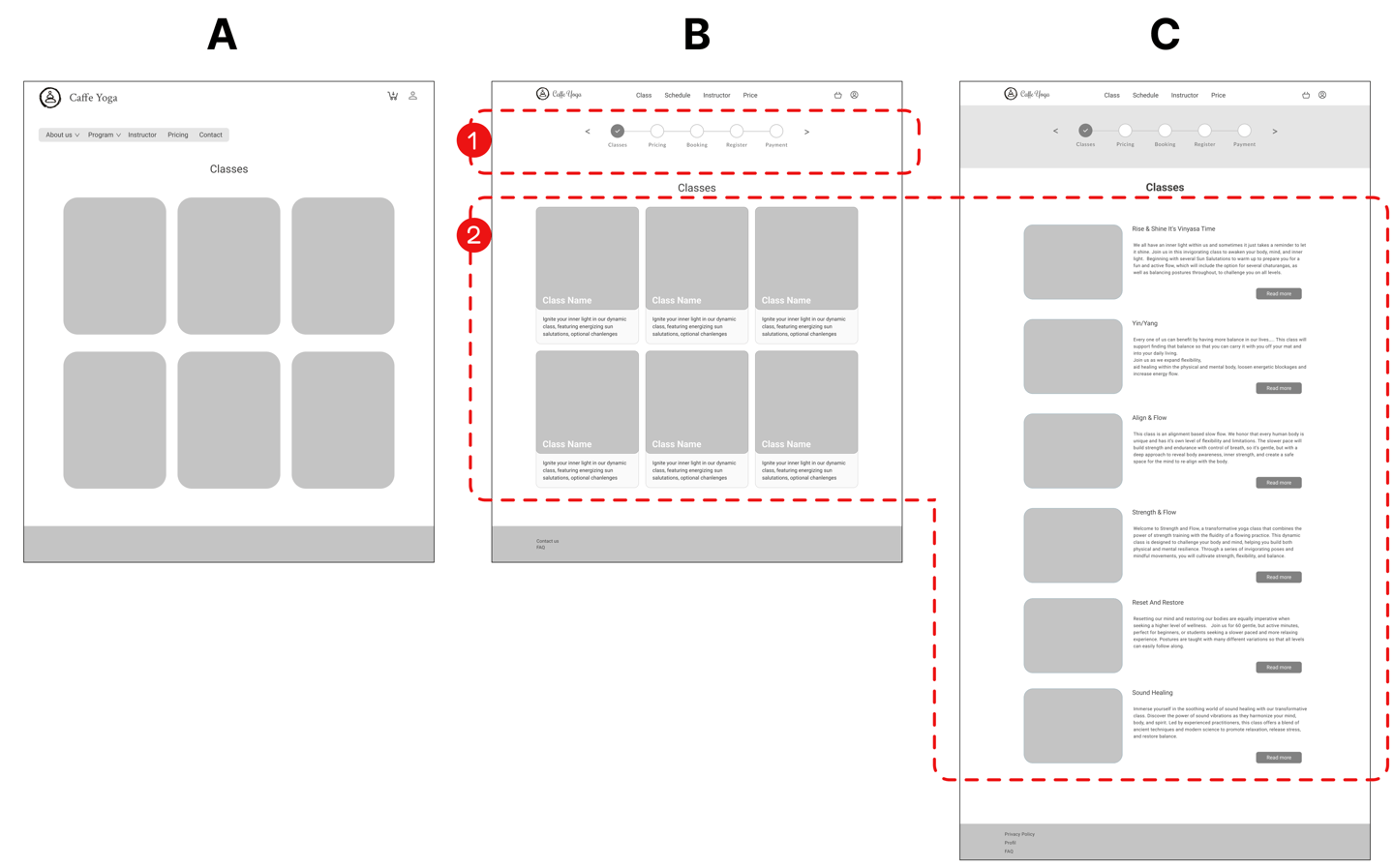
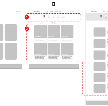
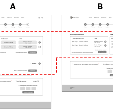
1- Progress Bar
During testing, we noticed that users needed to know their progress and upcoming steps in the class booking process. To address this, we added a progress bar to keep users informed at every stage.
2- layout
To improve the user experience, we shifted from a grid layout with brief text to a vertical list featuring expanded class descriptions. This change offers more information at a glance, making it easier for users to read, compare, and select classes efficiently.
Class Description
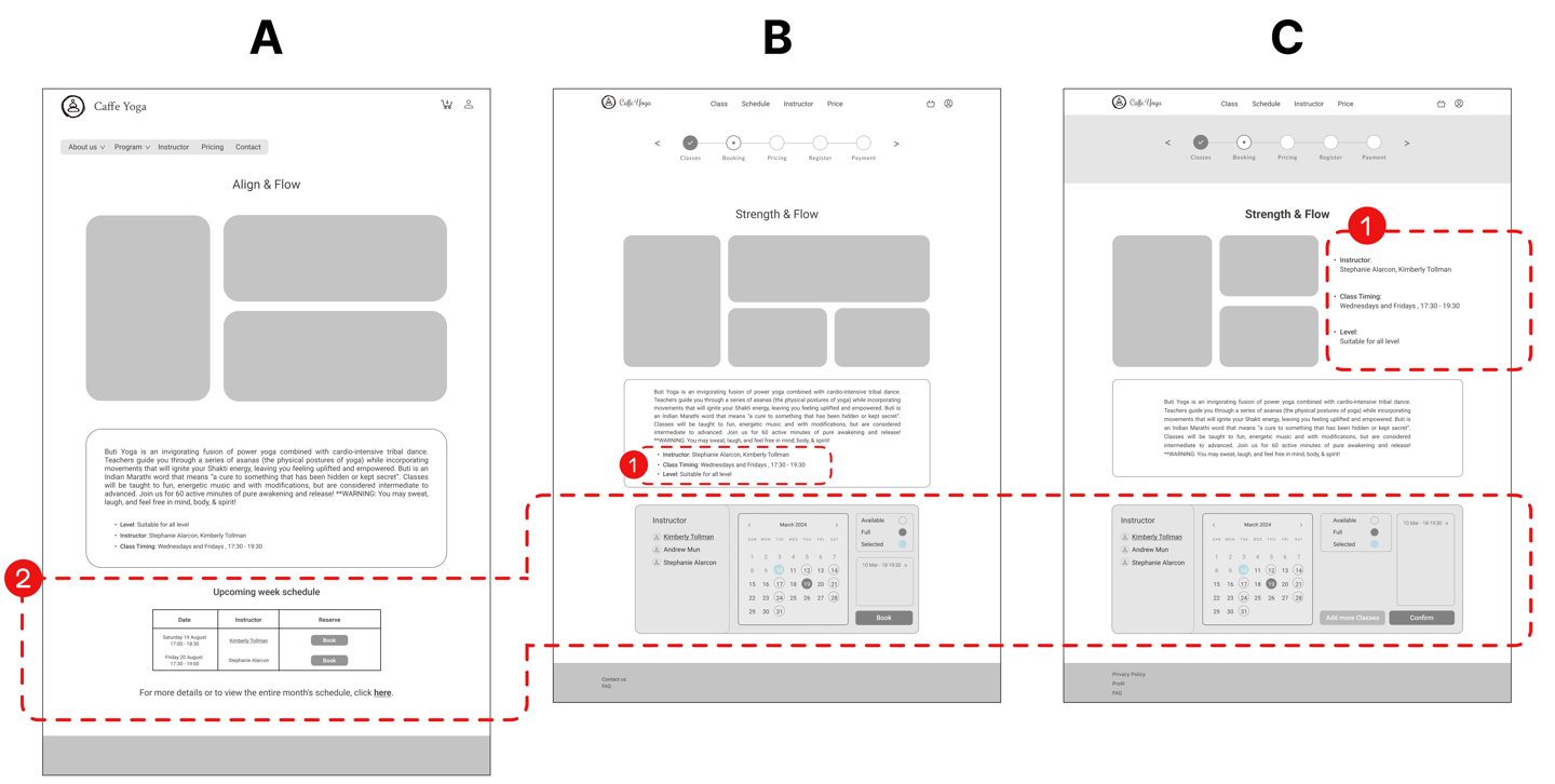
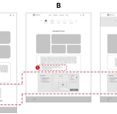
2- Booking Panel
The booking panel was reviewed multiple times. At one point, we updated the design to a dynamic panel where users can select available and booked classes on the calendar by choosing a coach's name.
Later, we noticed that users had trouble returning to the classes page, so we changed the "Book" button to "Confirm" and added an "Add More Class" button next to it.
1- 3 Key Class Aspects
In the second iteration, we found that repositioning three key aspects of the class improved users' ability to quickly scan the information, reducing the need for lengthy reading.
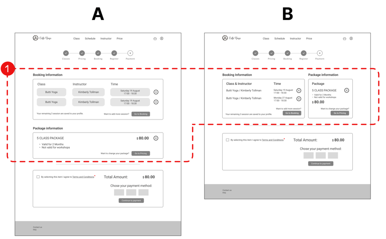
Shopping Basket
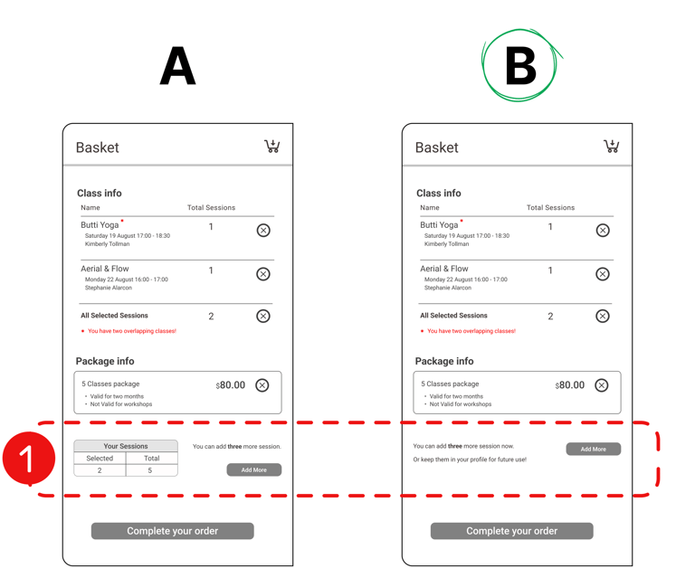
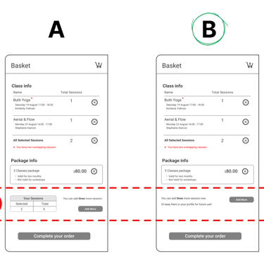
1- Session Display (A/B Testing)
The small table in version A, showing the number of remaining sessions from the selected package, led to user errors. During an A/B test, version B without a table was preferred.
Registration
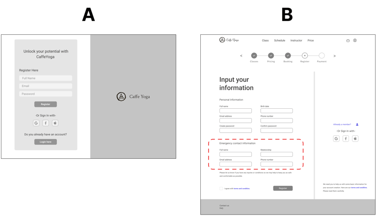
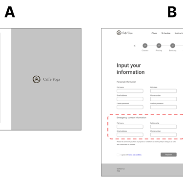
Required Information
At the request of the stakeholder, we needed to collect more information from users in this section, particularly details that could be useful in case of an emergency. Therefore, we reviewed other similar sites and decided to add emergency contact information to this section.
Payment
1- Confirmation
In the confirmation section, the large information boxes for selected classes and packages caused users to lose focus and scroll more. To improve the user experience, we placed the selected classes and packages side by side.
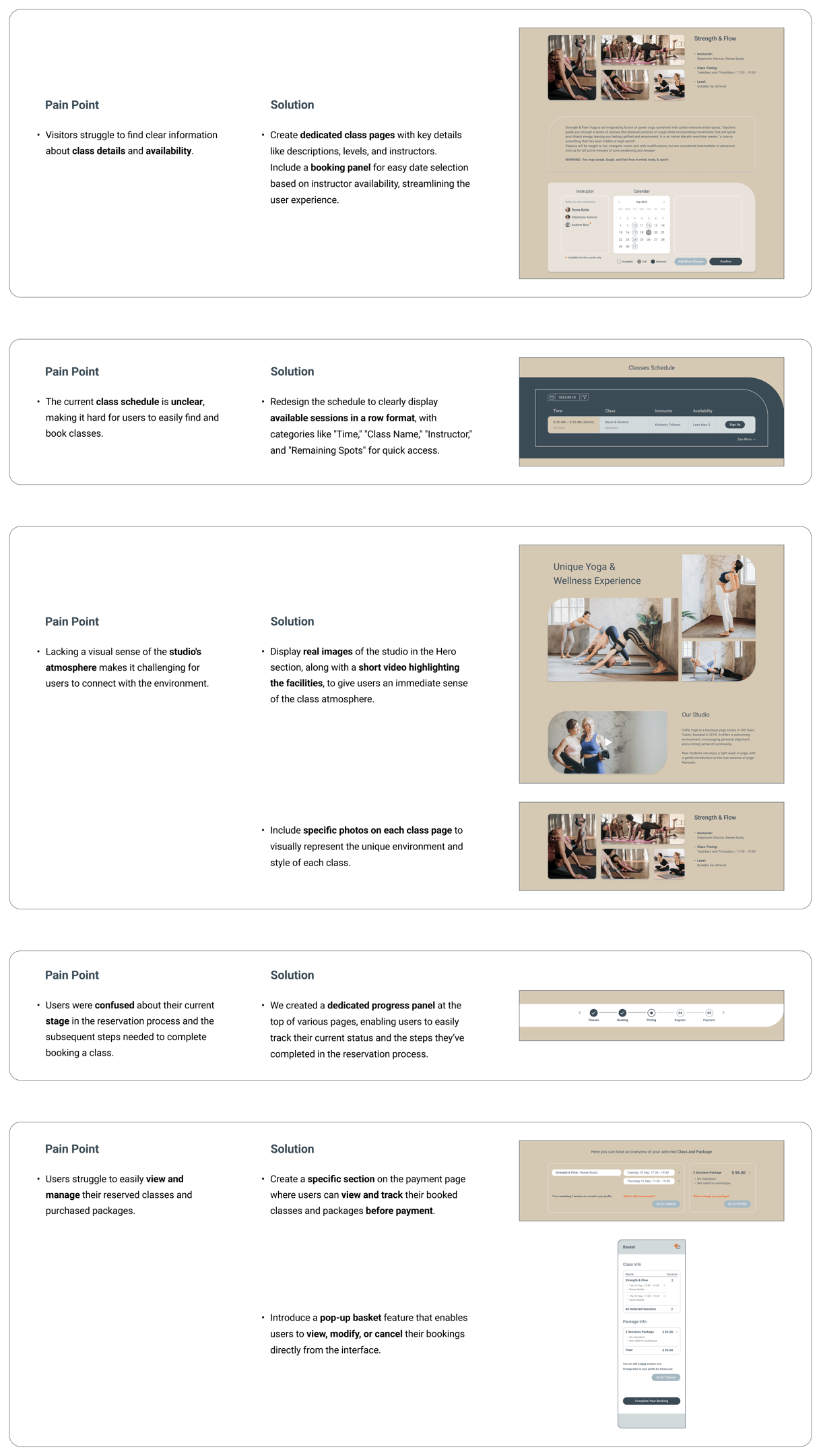
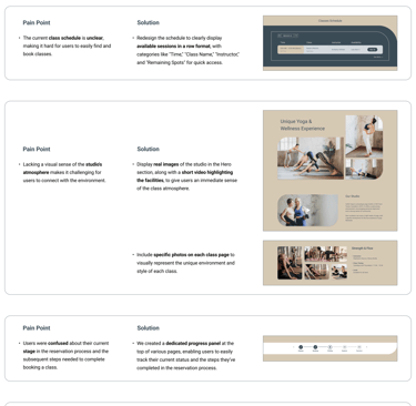
Challenges & Solutions
What design decisions did we make?
After finishing our research, we pinpointed the main challenges users were experiencing and addressed them through thoughtful design solutions.
The before-and-after images show how our design evolved to solve these issues.
Deliver
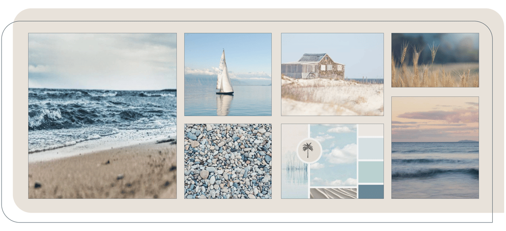
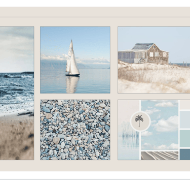
Mood Board
Since one of the primary issues with the old site was the inconsistency across pages and sections, the team decided early on to steadily develop a mood board, considering the calm nature of
the business.
The Calm-Inspired Mood Board
UI Kit
Drawing inspiration from the mood board and focusing on technical aspects, we began using a UI Kit. This approach allowed us to create a cohesive and balanced user interface, which will also streamline the design of additional components in the future.
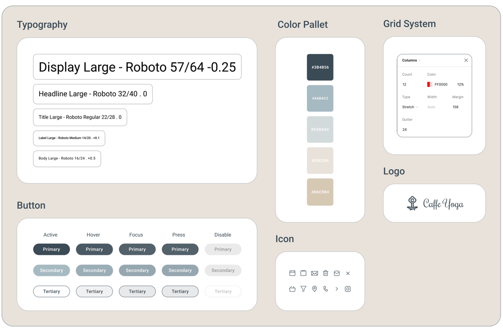
The Caffe Yoga Website UI Kit
UI Design Approach
Color Accessibility
The contrast between the pages' and buttons' foreground and background color was tested using color blindness simulators to ensure accessibility and readability for all users.
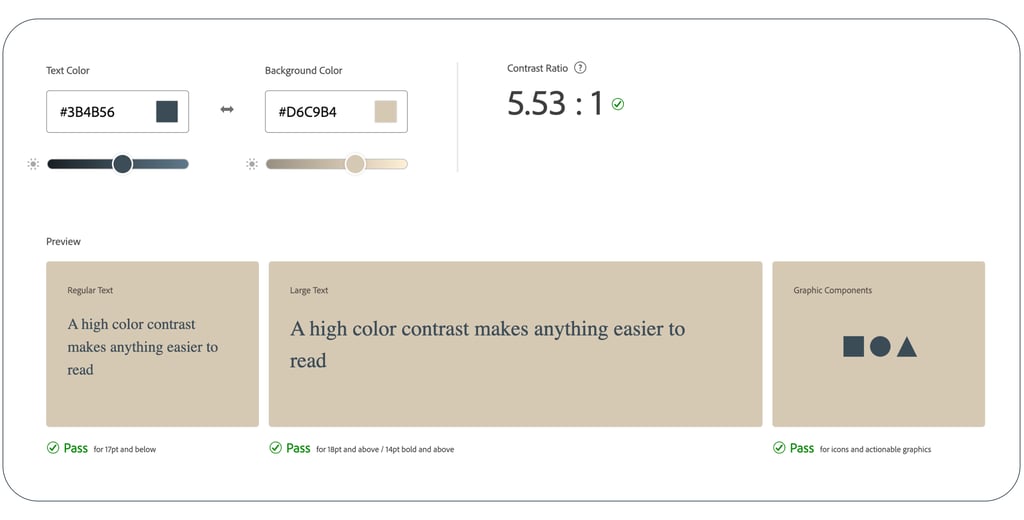
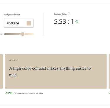
Accessibility Test Result
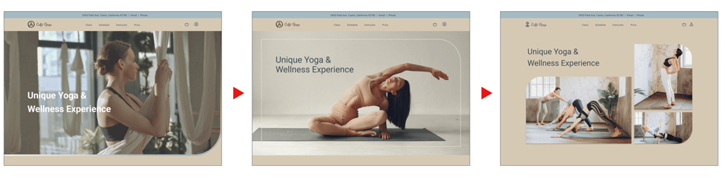
Some iteration of the Hero Area
Iteration
After applying the UI Kit, we worked closely with our team and stakeholders to quickly make improvements through several iterations. Even with limited time for full user testing, we were able to enhance the user experience that some of them shown below. We understand that testing and refining is an ongoing process.
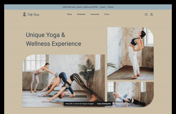
Hero Area
We iterated several times on the hero area while applying the UI kit. After reviewing feedback, we aimed to maximize its impact on the project's goals and ultimately chose the final version, which introduces the studio with several photos.
We provided feedback to help finalize a suitable Logo
Logo
Based on our research and stakeholder input, we redesigned the studio logo to align with the new website’s visual identity, adding a calm, personal touch with a hand-drawn meditation figure and soft script font. The final version refines this with a minimalist yoga pose, emphasizing clarity, peacefulness, and modern elegance.
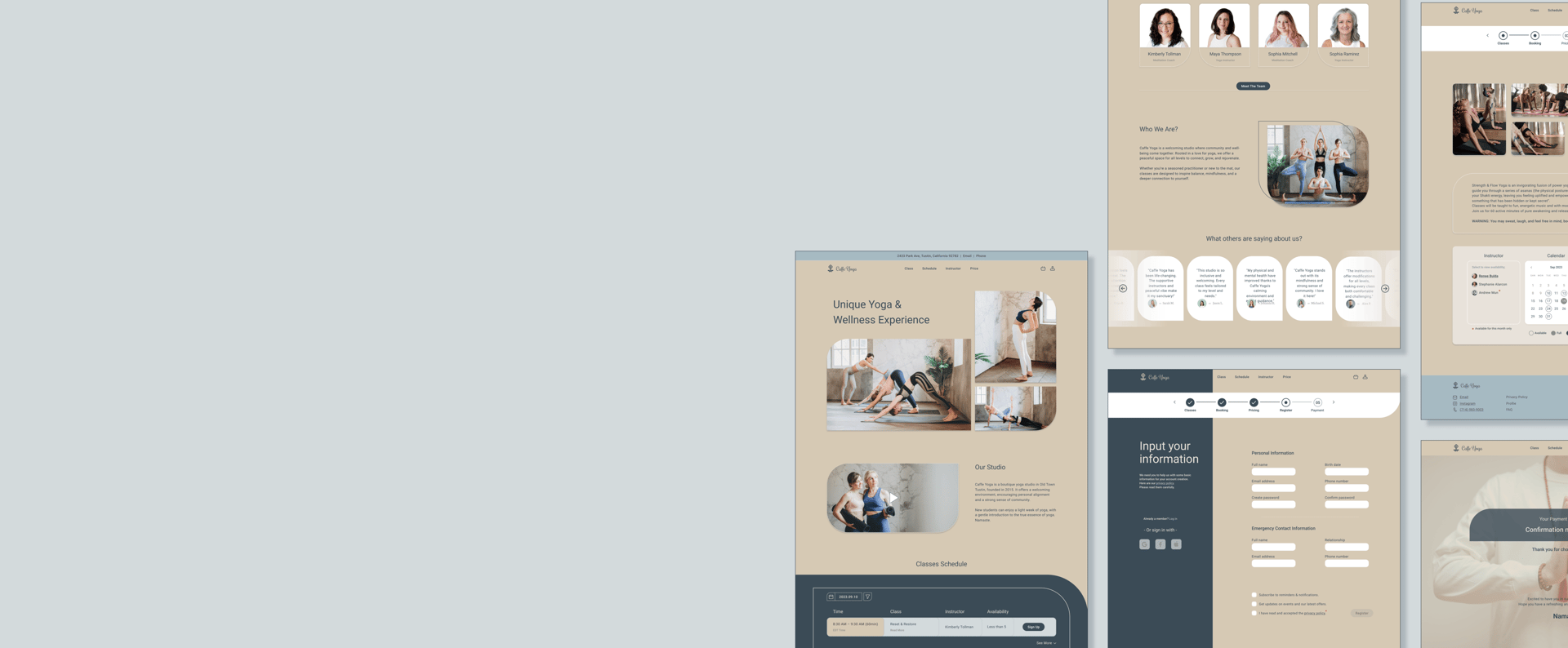
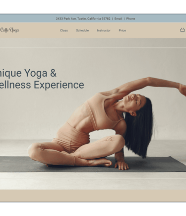
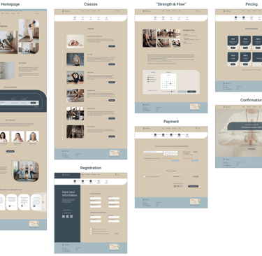
High Fidelity Prototype
Let’s take a quick look at our final high-fidelity designs, now complete with colors and images!
Note: We used high-quality unreal images for a better visual display.
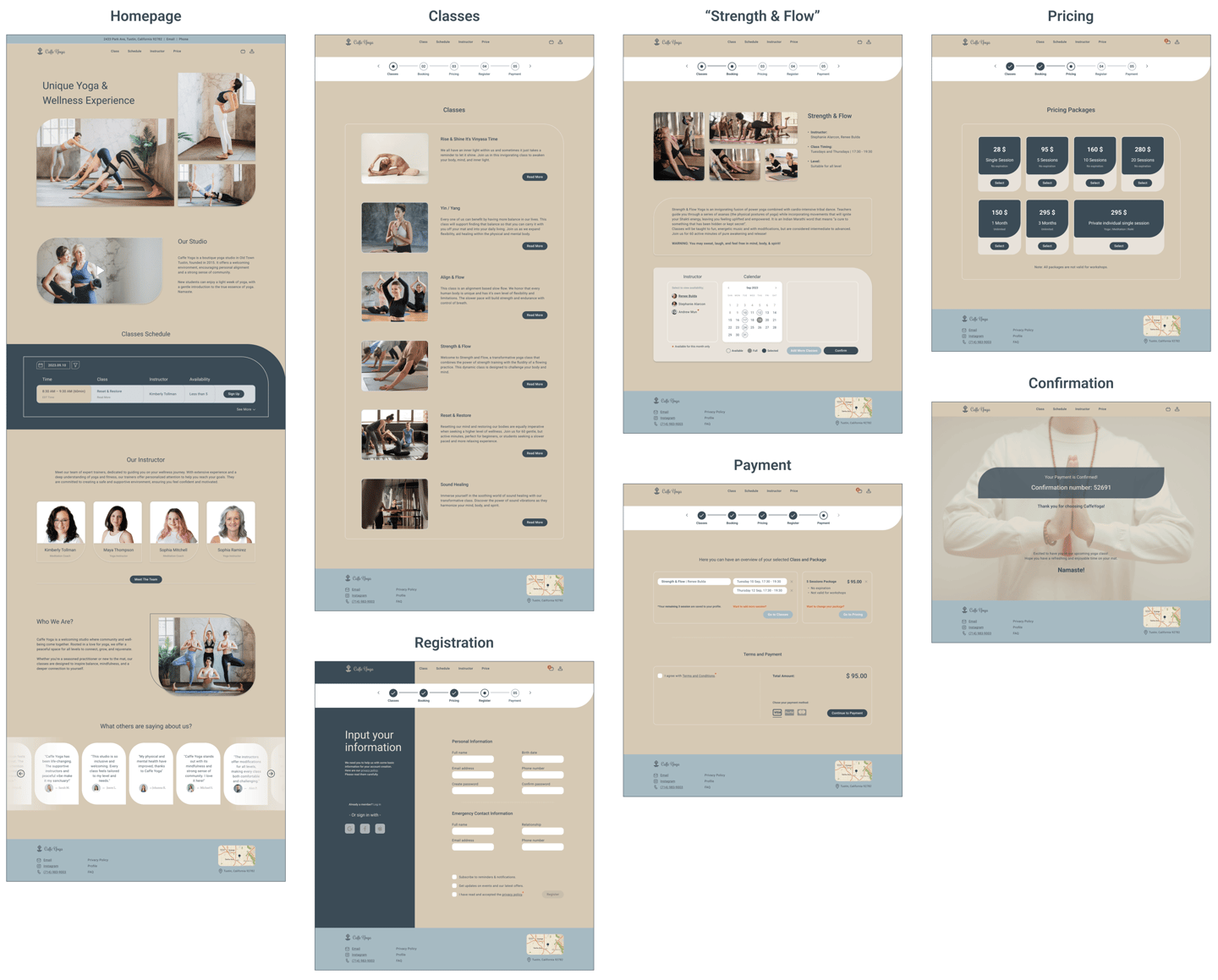
Here you can view the final prototype on Figma.
Reflection
What did I learn?
I learned how to effectively evaluate an existing website and lead a team to address specific design challenges.
I realized that gaining a deep understanding of the business and considering the stakeholder's perspective early in the process significantly improves research and results in a more effective and cohesive design.
What's next?
We plan to conduct several usability tests to improve the flow of the booking process through class for users.
Given the importance of the coach from the users' perspective, and following the stakeholder's request, we will take on a new task to redesign the booking through the instructor menu.
We will reexamine the color accessibility of the buttons, particularly the secondary ones, to ensure they are accessible for users with vision impairments.